Warthen Team
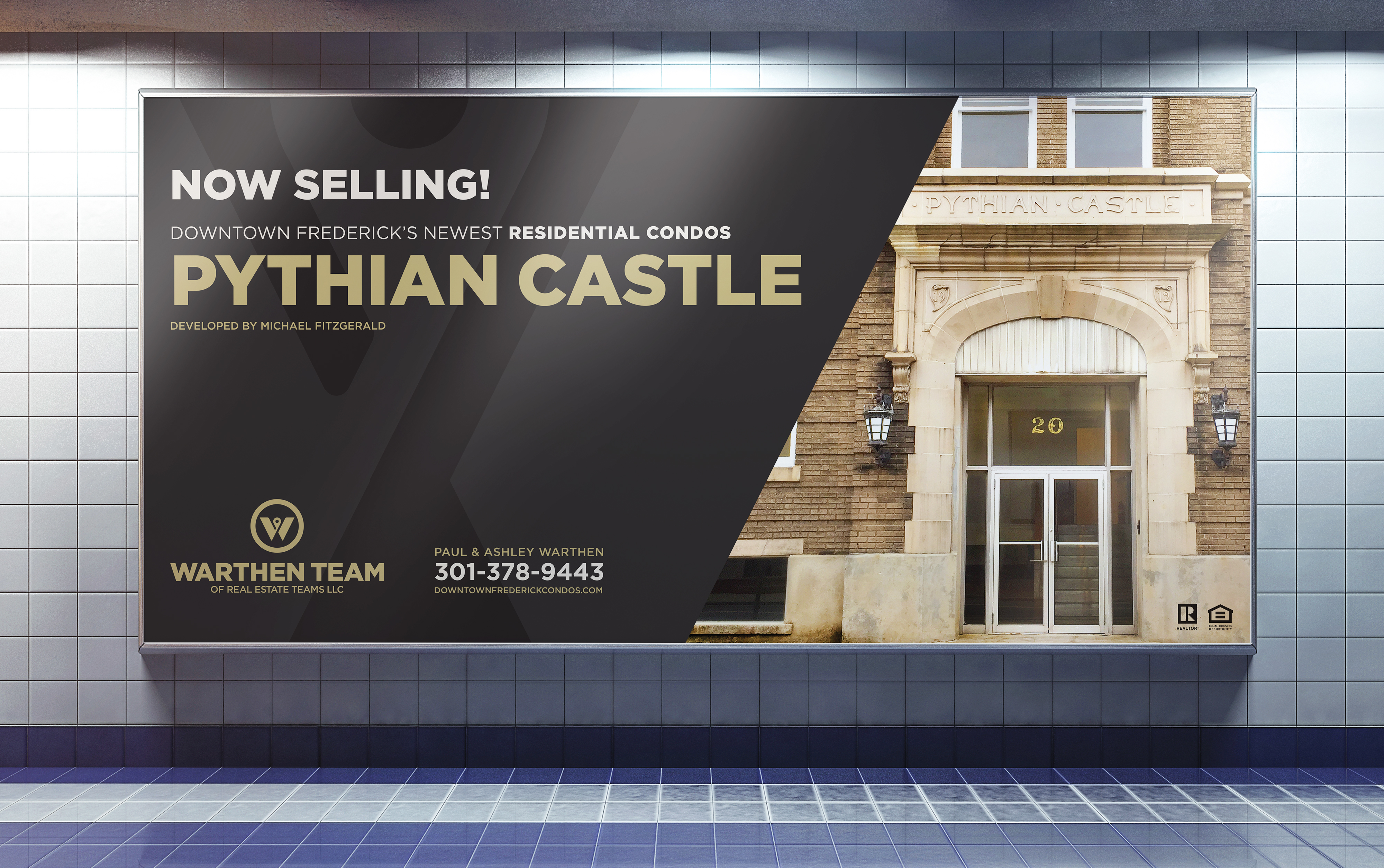
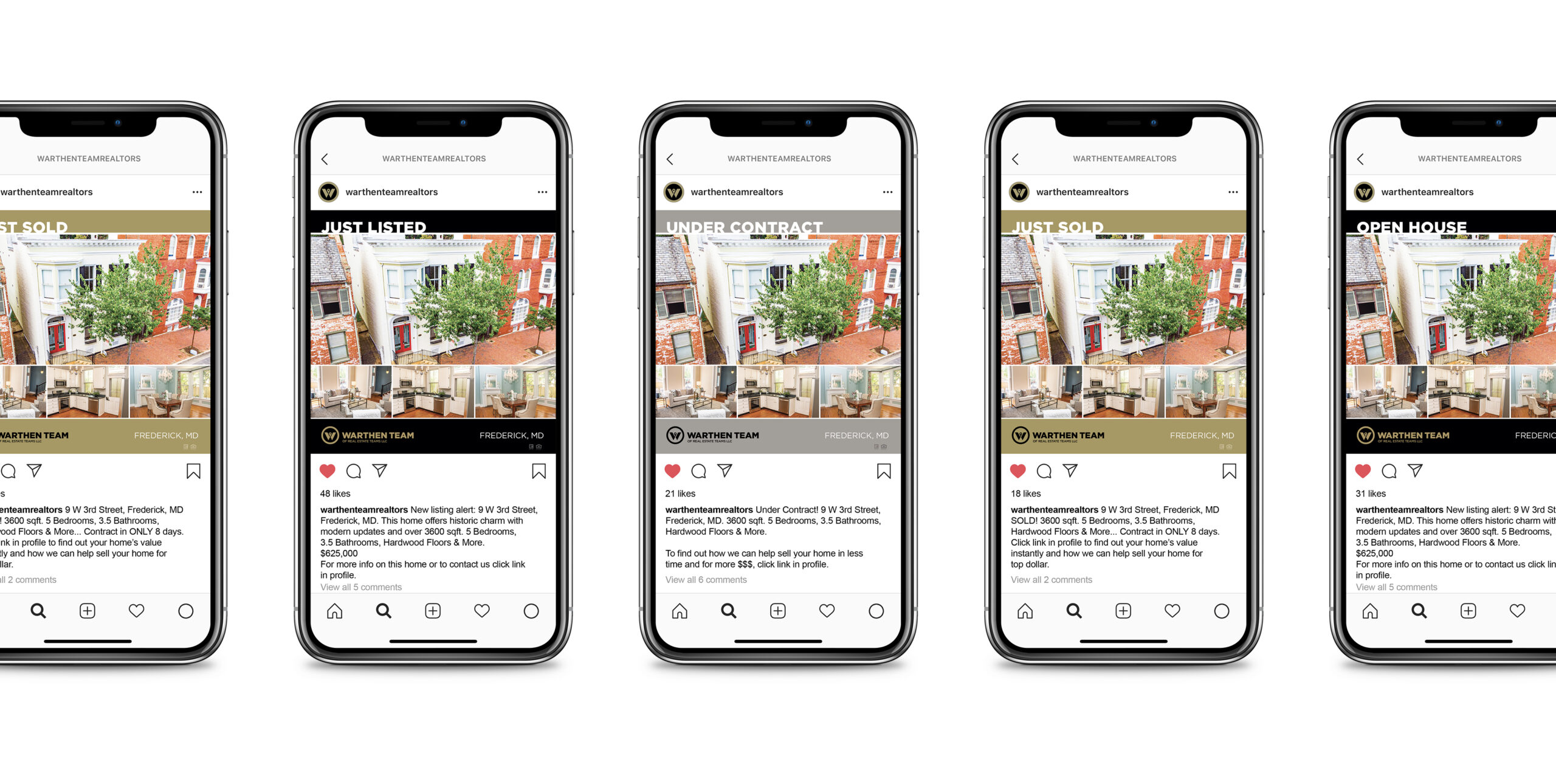
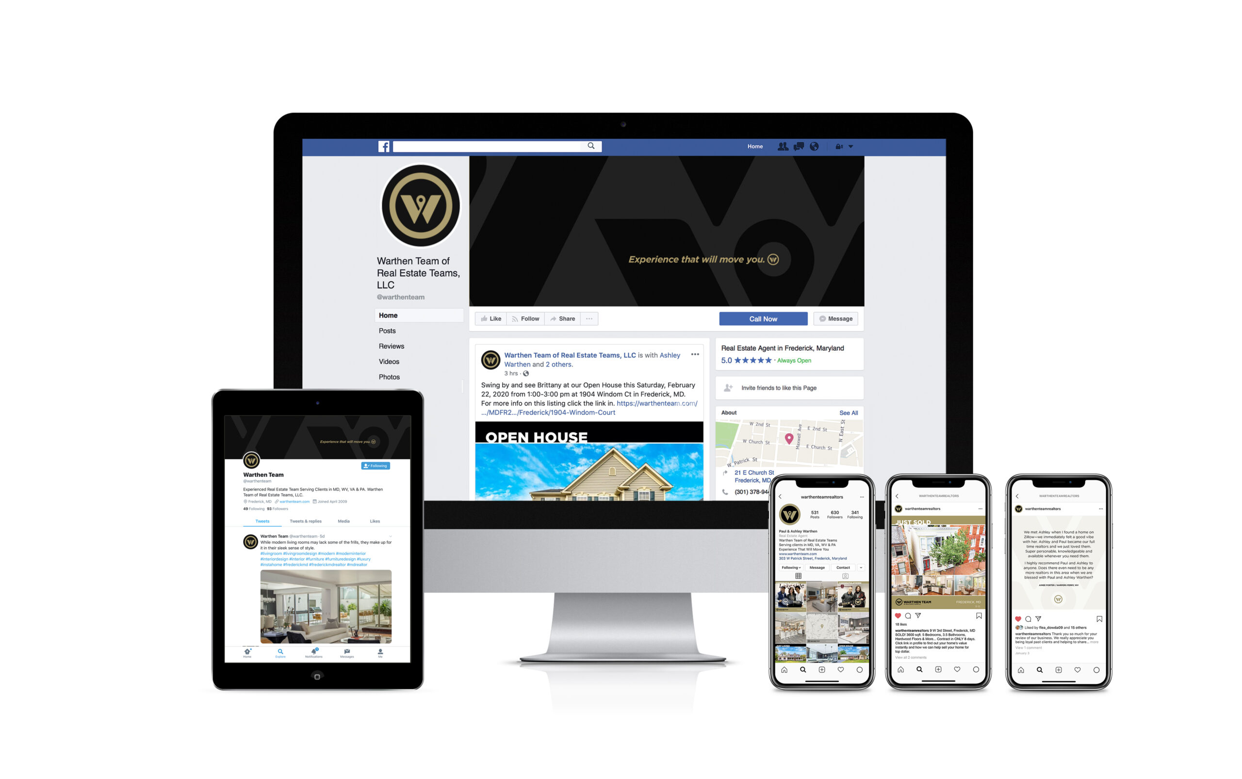
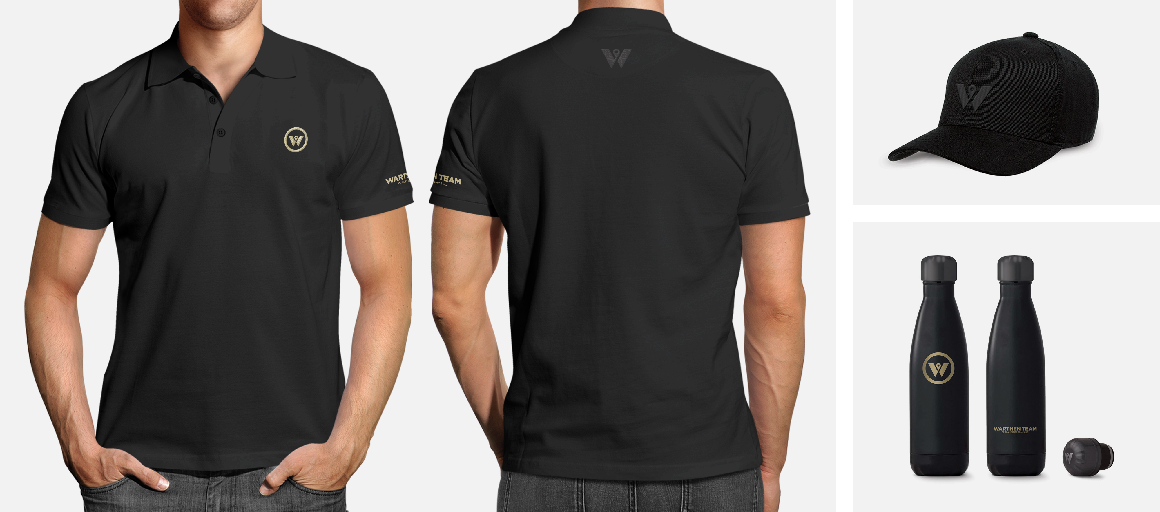
SERVICES Brand Discovery & Strategy / Logo Design & Brand Identity Development / Tagline Development / Collateral Design / Publication Design / Signage Design / Apparel Design / Social Media Asset Design / Social Media Marketing Design / Property Promotional Design
THE STORYA real estate team is a real estate team, right? They’re all pretty much the same, aren’t they? Nope and nope. Problem is, with so many out there, how do you know which to choose? Who’s better? And why? Those kinds of questions were exactly why the Warthen Team turned to Lisa Sirbaugh Creative when it was time to rebrand. They’d perfected the right mix of elevated service, knowledge, and responsiveness and turned it into a true five-star experience for clients. After a careful assessment of their brand, they recognized that they had outgrown their brand identity. It also became evident that there was a lack of consistency and cohesion in their messaging and marketing materials. With a solid five-star customer experience in place, it was time for the brand, as a whole, to measure up.
Lisa’s upfront brand identity discovery phase was amazing. The process made us look at our business differently, helping us to narrow down our strongest brand characteristics and identify the qualities that set us apart. The information gathered enabled her to create a unique and personalized brand strategy and visual identity system that clearly speaks to who we are as a business. We’re so thrilled with the results and look forward to working together for a lifetime.
ASHLEY & PAUL WARTHEN | WARTHEN TEAM PRINCIPALS
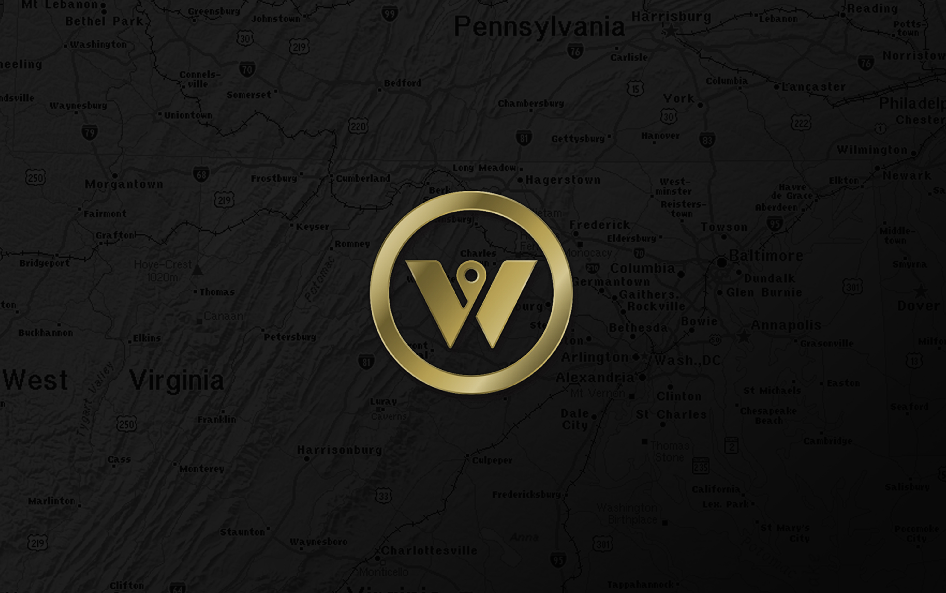
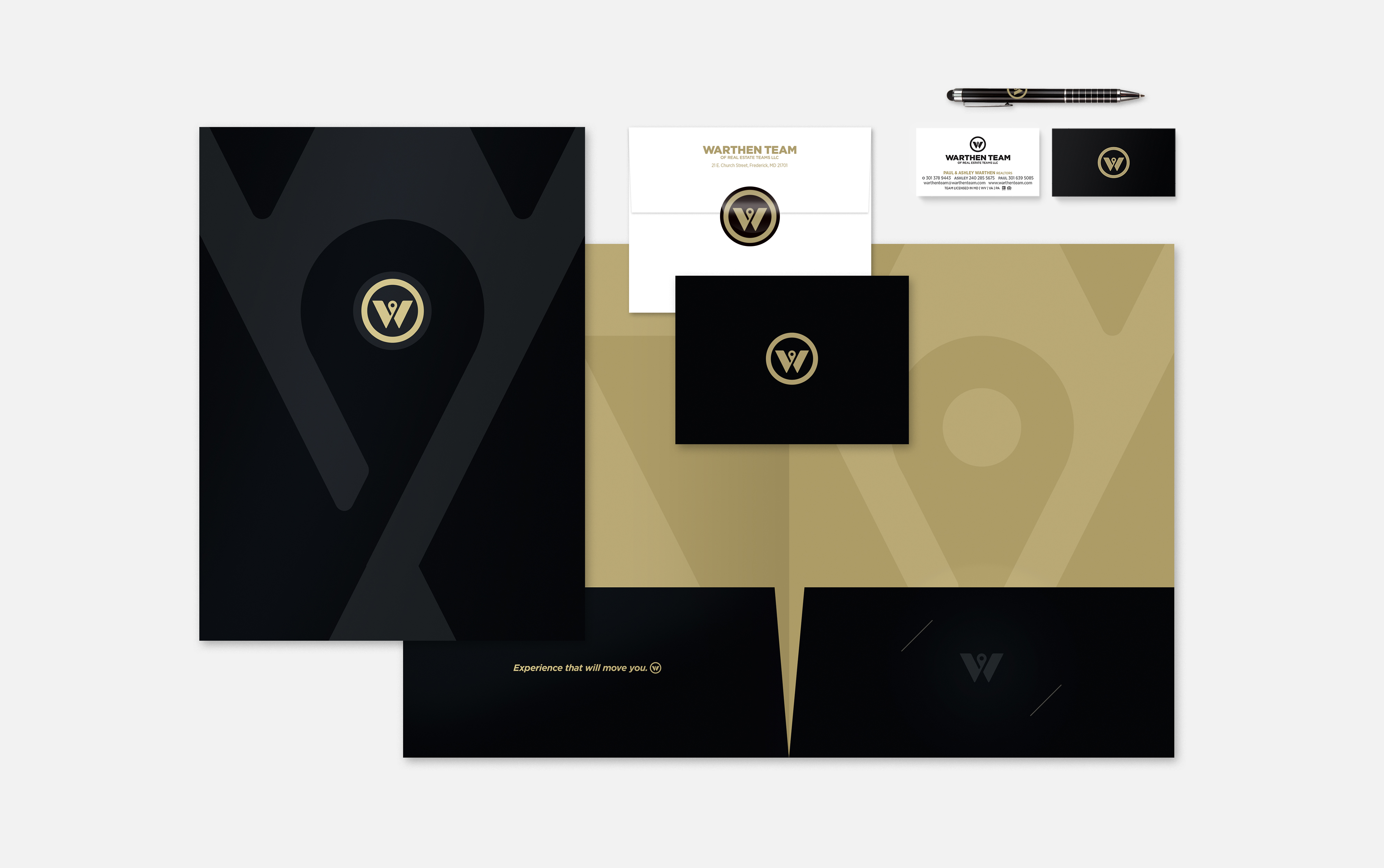
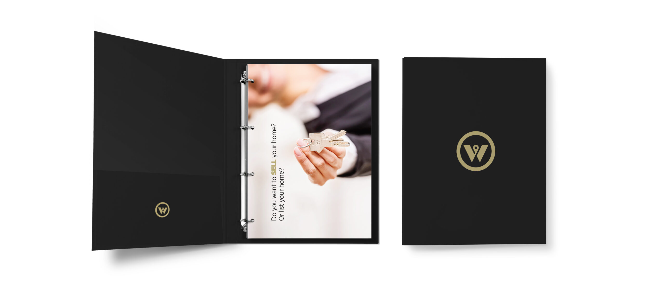
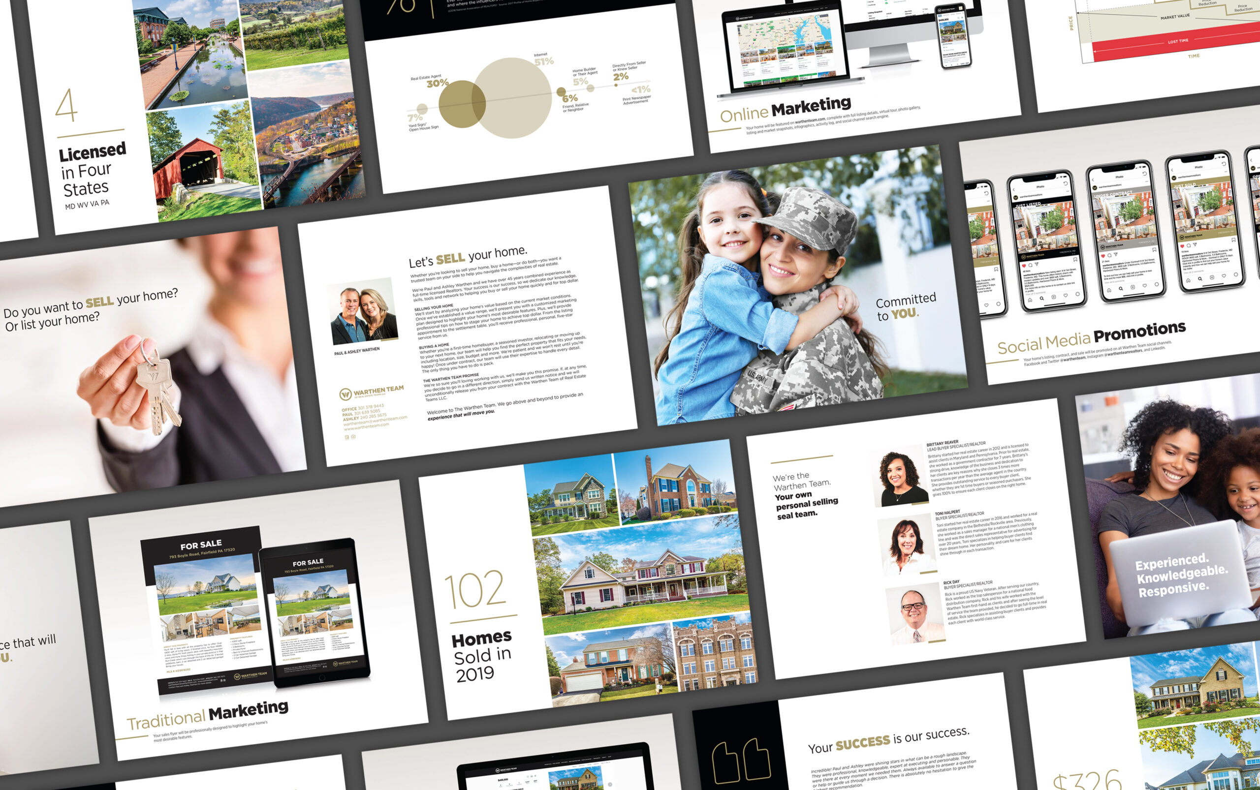
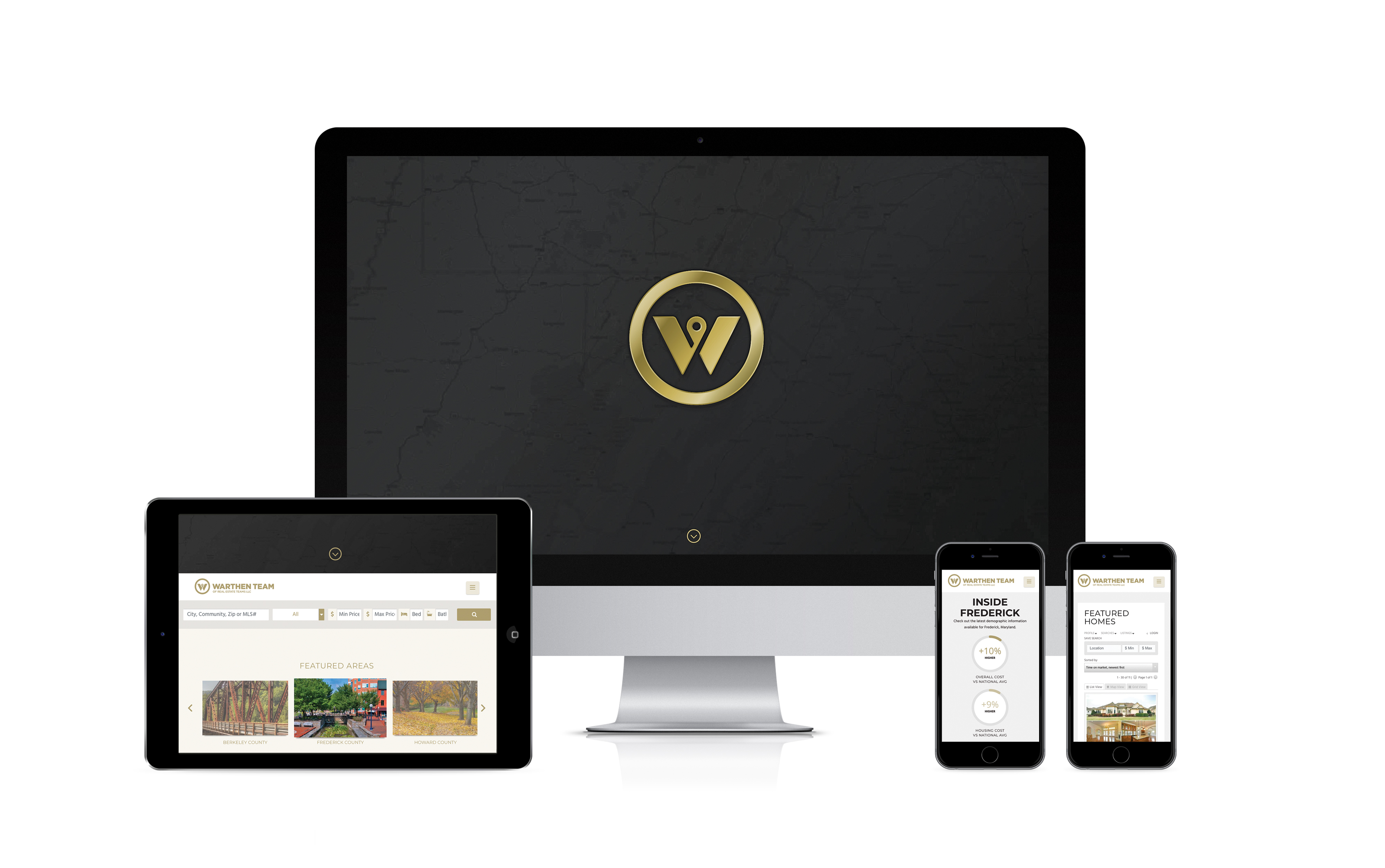
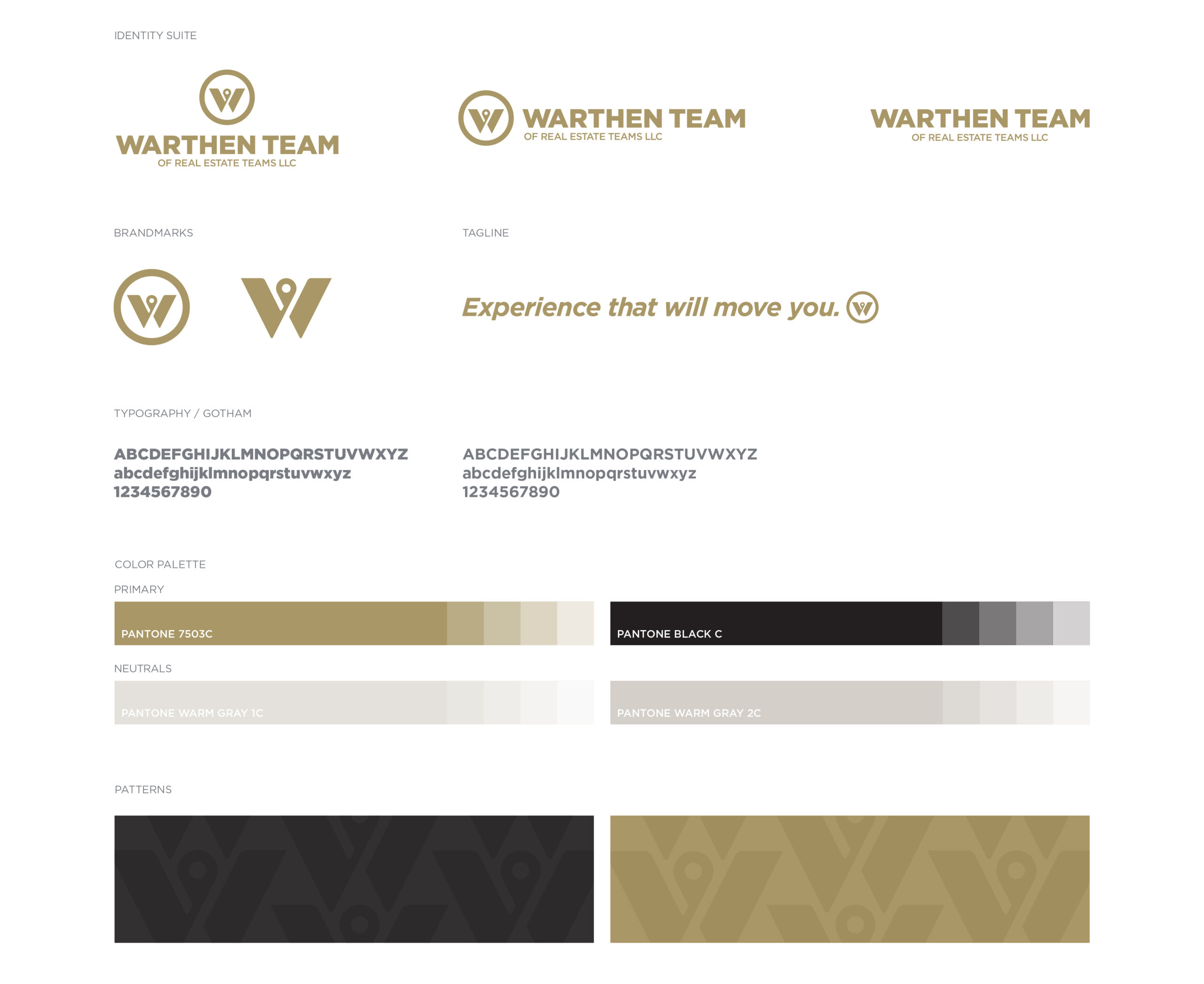
THE SOLUTIONBefore I ever put pencil to paper or pixel to screen, I sat down with the client to get to the heart of who the Warthen Team really is. At the end of that discovery process we developed a brand platform to guide the direction of the new brand identity and all print and digital touchpoints. Part of our discovery process was determining the brand's core characteristics: refined, simple, modern, and masculine—the new brand identity suite delivers on each one of them. The suite showcases a brankmark that unites the W of the company’s name with a location pin—which makes perfect sense for real-estate buying and selling, as well as property investments. After all, as they say, real estate is all about location, location, location. The W in the mark cradles the pin, highlighting the Warthen Team not just as a trusted source, but as a tight-knit group of strategic caretakers. From there we carefully designed and developed company collateral, social media assets, a comprehensive property promotional marketing packaging, team apparel, promotional products, signage, and much more. For each and every touchpoint, the objective was the same—a Michelin star experience that showcases the true essence of the Warthen Team brand and promise: Experience That Will Move You.
THE SOUVENIRSAmerican Advertising Awards, Gold ADDY for Brand Identity CampaignAmerican Advertising Awards, Silver ADDY for Logo DesignMUSE Creative Award for Logo DesignLogoLounge Book 10

