Clean Green Simple
SERVICES Brand Discovery / Logo Design & Brand Identity Development / Social Media Asset Design
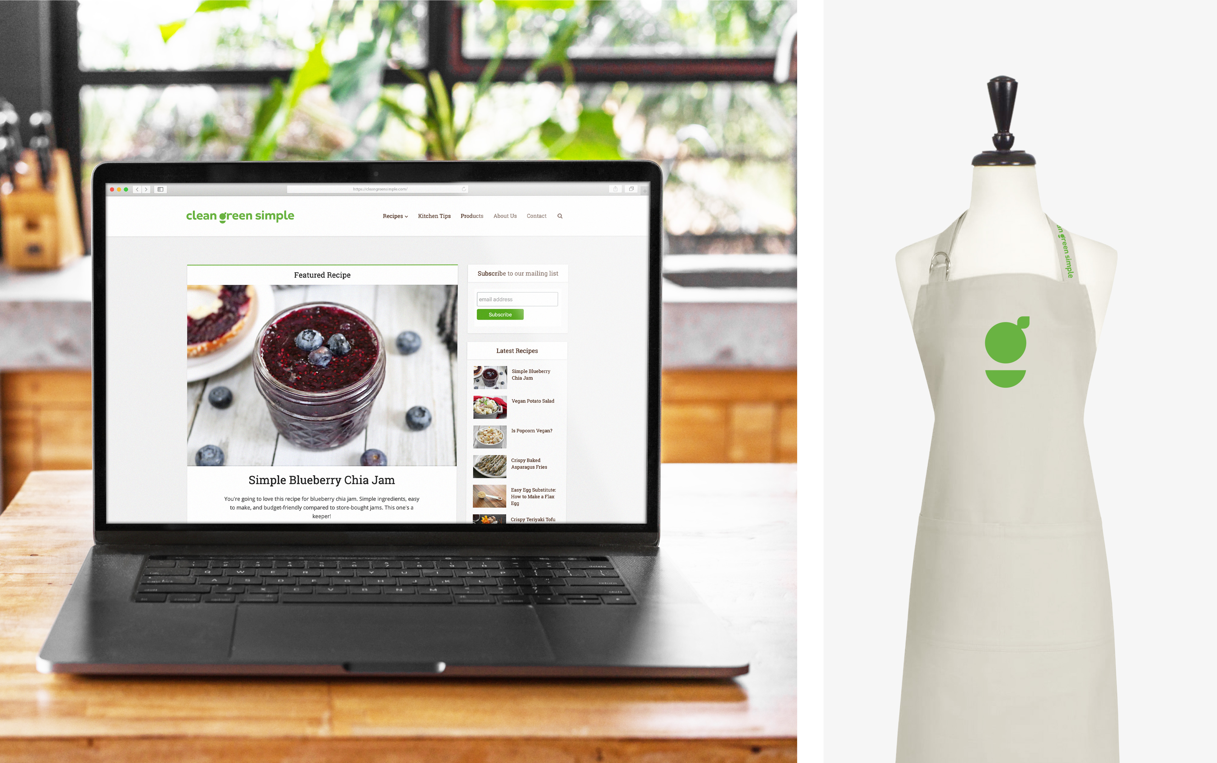
THE STORYClean Green Simple is a respected online resource for people looking to eat clean, live green, and keep life simple. It offers a judgment-free zone, open to anyone interested in optimal health and being nice to our planet, while still living a modern lifestyle. With a focus on plant-based eating and sustainable living, Clean Green Simple also features vegetarian recipes with minimal animal products, such as eggs, dairy, and honey; helpful how-to content for kitchen, home, and garden; and reviews of the latest eco-friendly products and services. In 2019, the lifestyle website welcomed new ownership and along with it, an evaluation of its brand, content, audience, and online presence. Clean Green Simple approached Lisa Sirbaugh Creative with an outline of their rebranding goals; their need to comply with Google AMP logo guidelines and online publishing app requirements; and a mission to honor the founder's vision—providing their audience with healthy lifestyle insights that deliver on its promise—clean, green, and simple.
I had the opportunity to work with Lisa Sirbaugh Creative to develop the brand identity for Clean Green Simple and I couldn’t be happier with the results. As someone who’s been in digital media for nearly 20 years, I was really impressed with Lisa’s methodical process. When she presented the initial logo concept, she shared her thought process, high-level themes, etc. In the end, the final product that Lisa delivered exceeded my expectations, and it’s energizing to now see it reflected on my website and social media presence. If you need help with graphic design and brand identity development, get in touch with Lisa Sirbaugh Creative today.
JIM ROBINSON | CLEAN GREEN SIMPLE PRINCIPAL
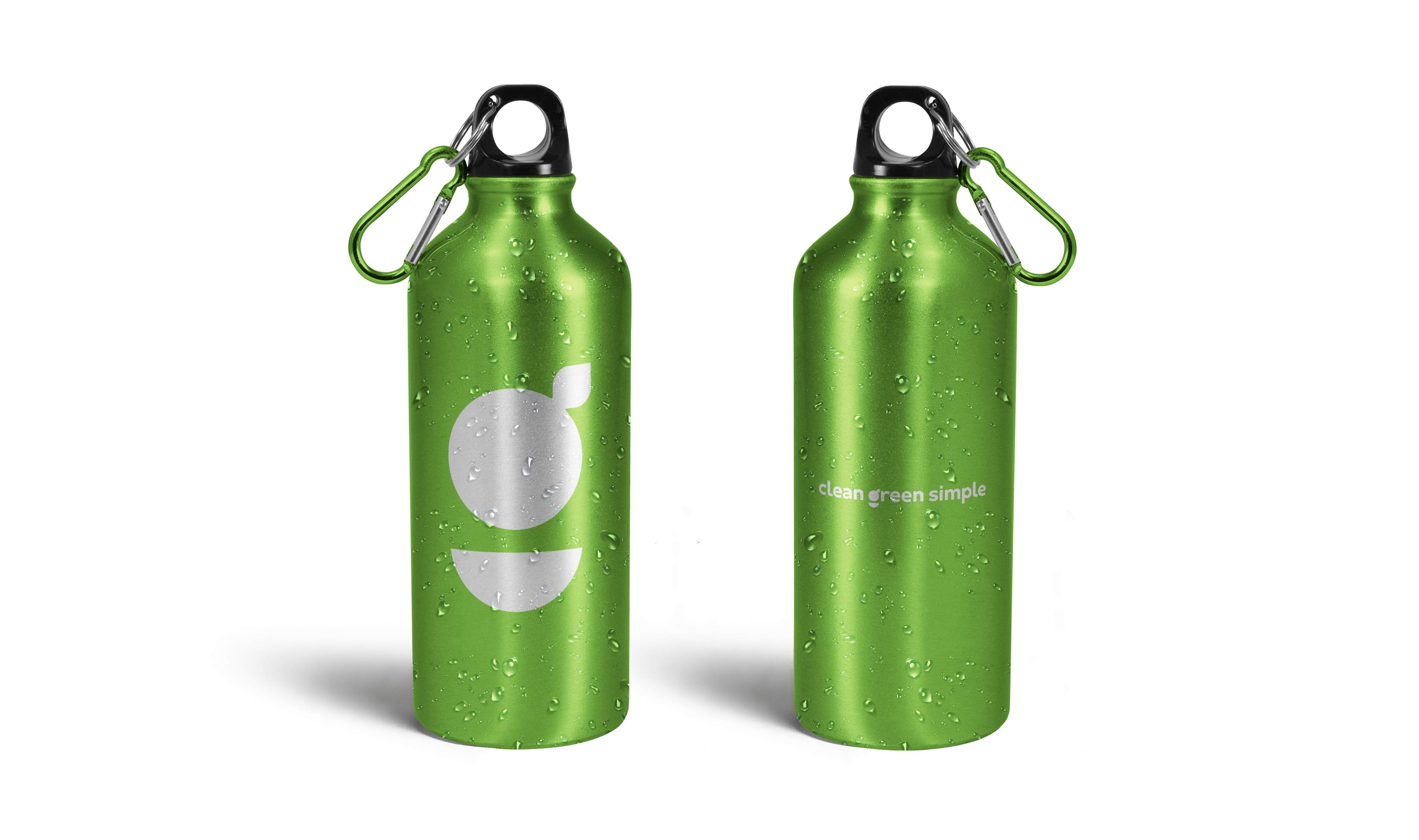
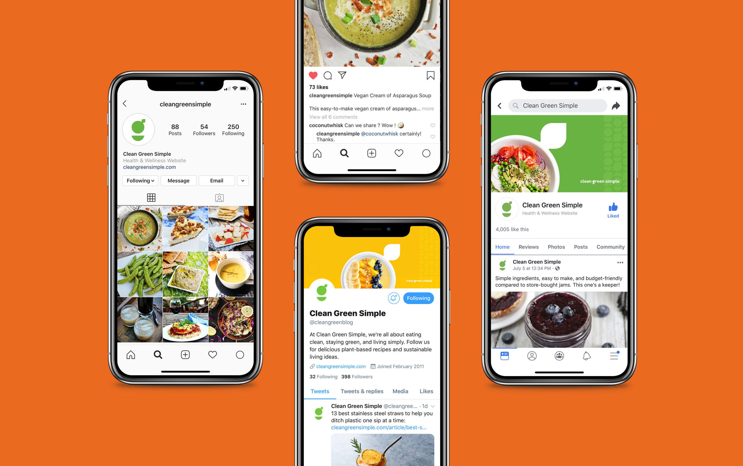
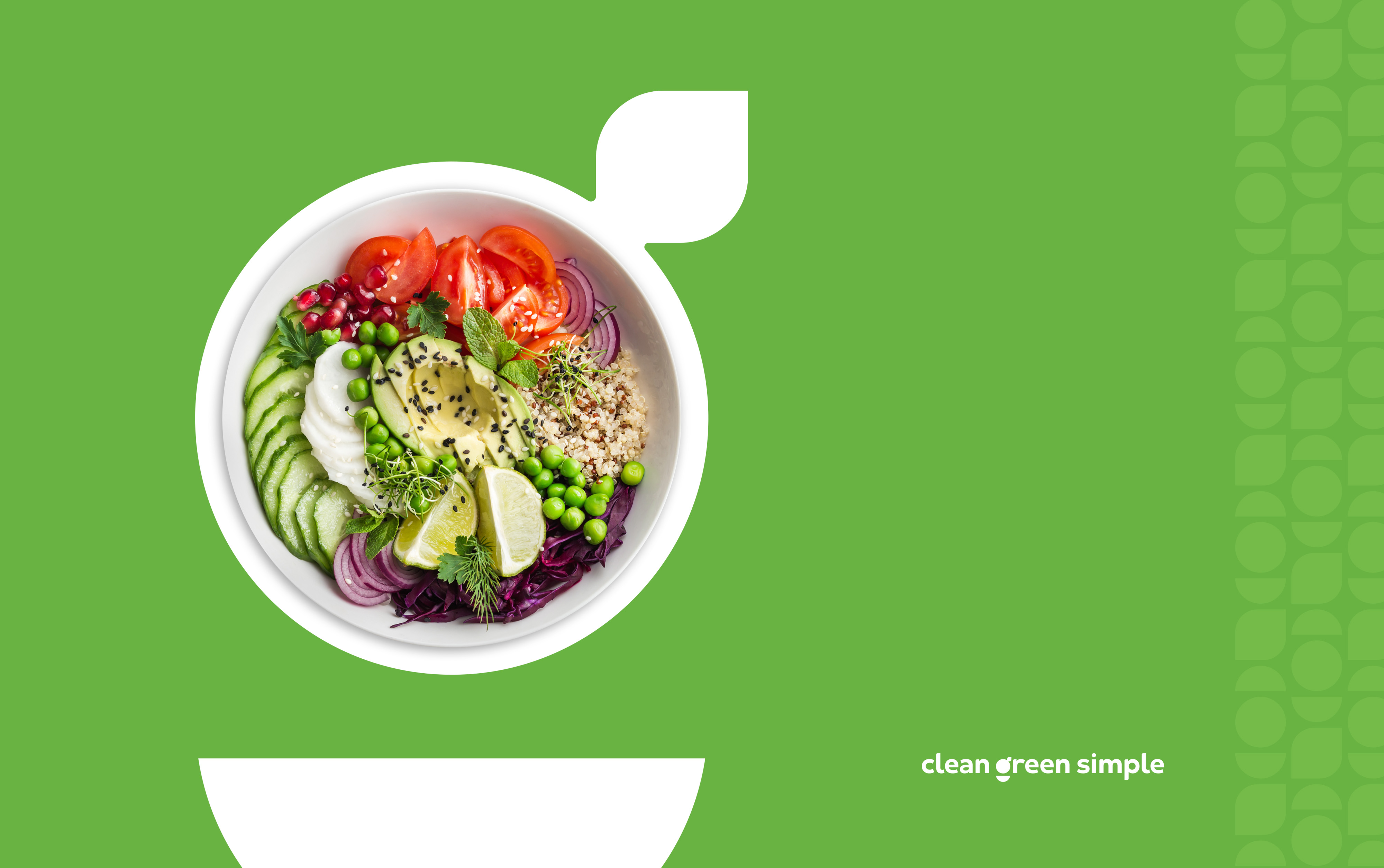
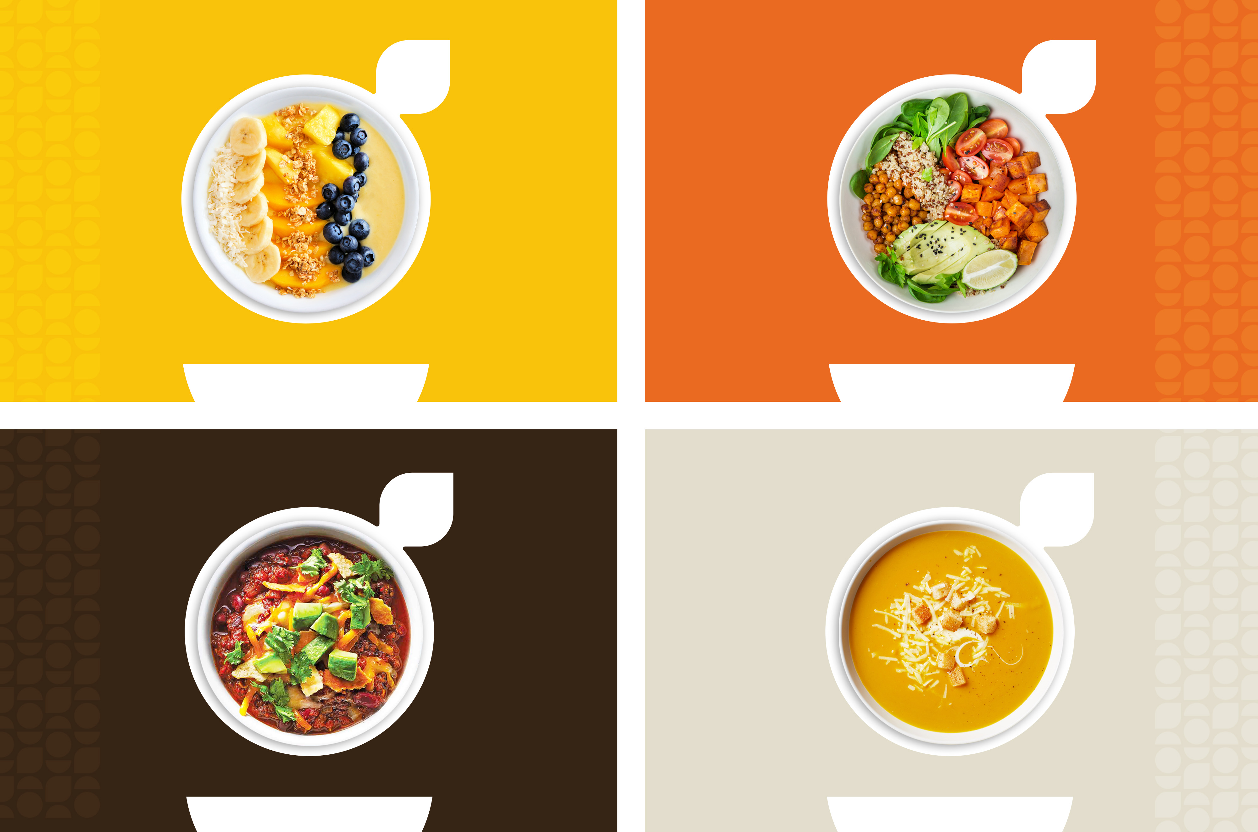
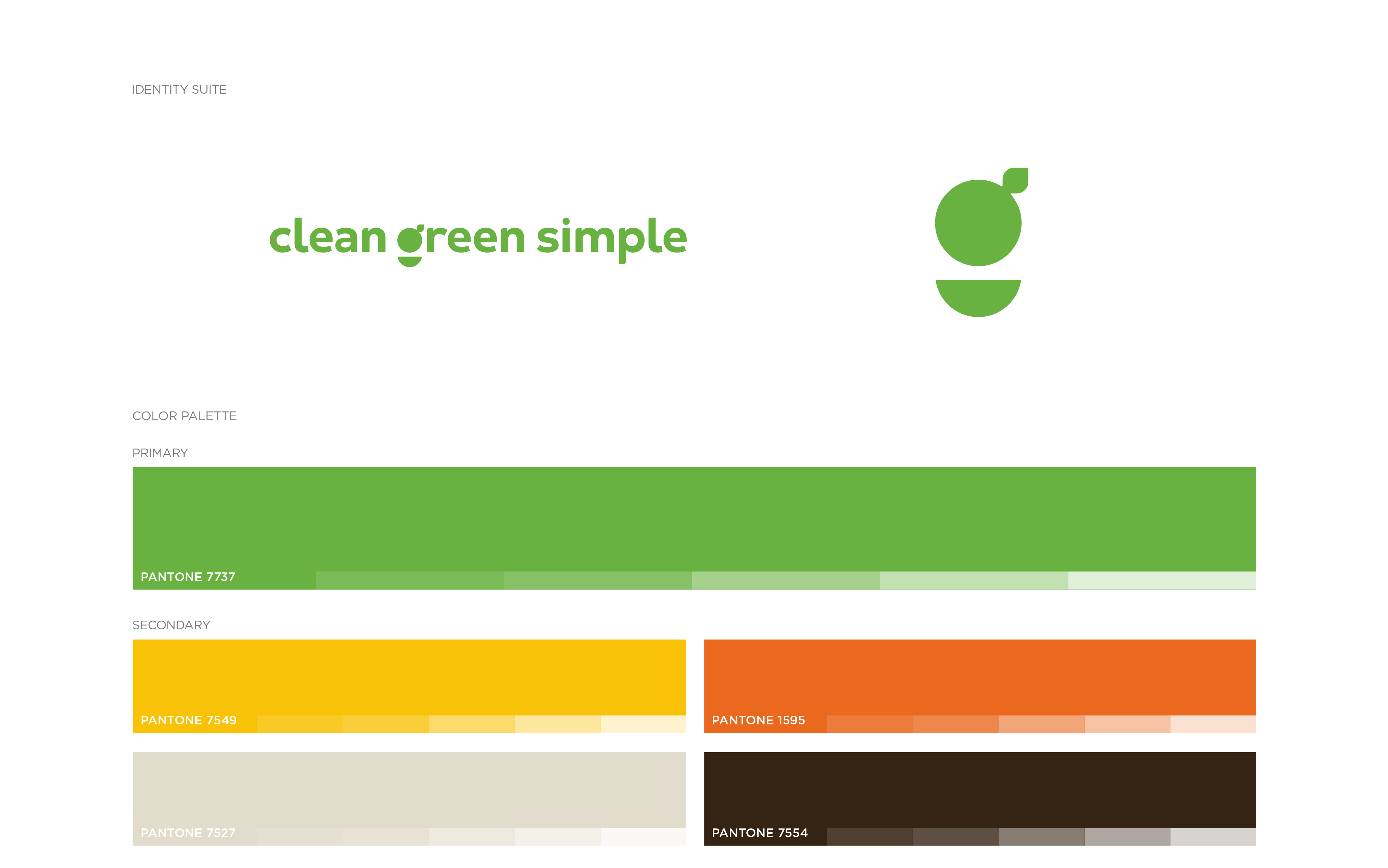
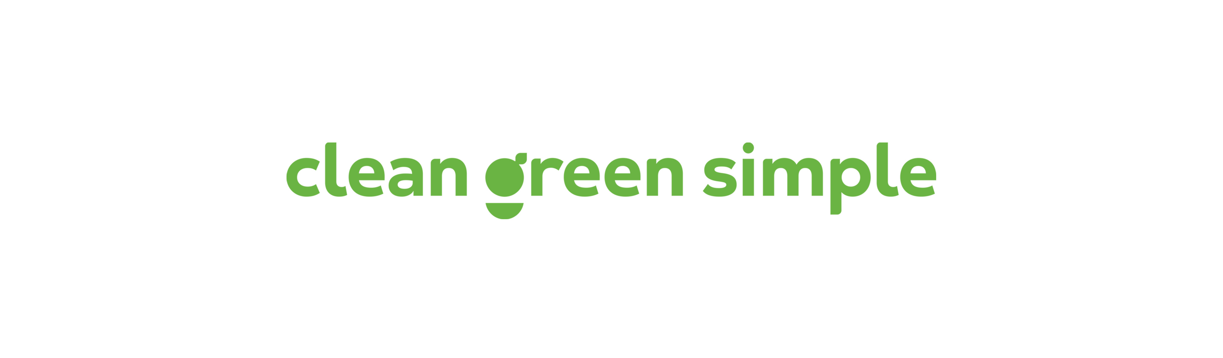
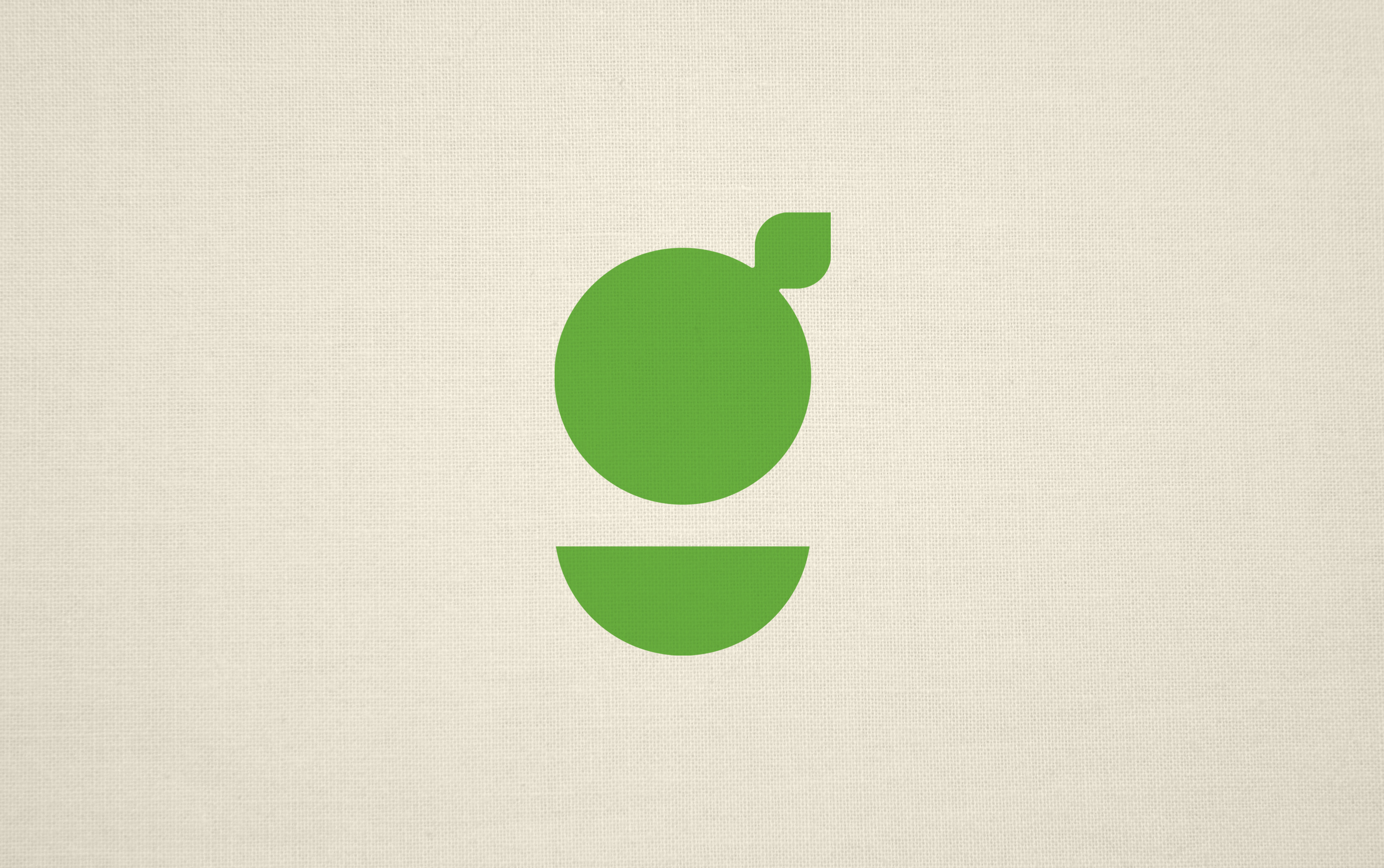
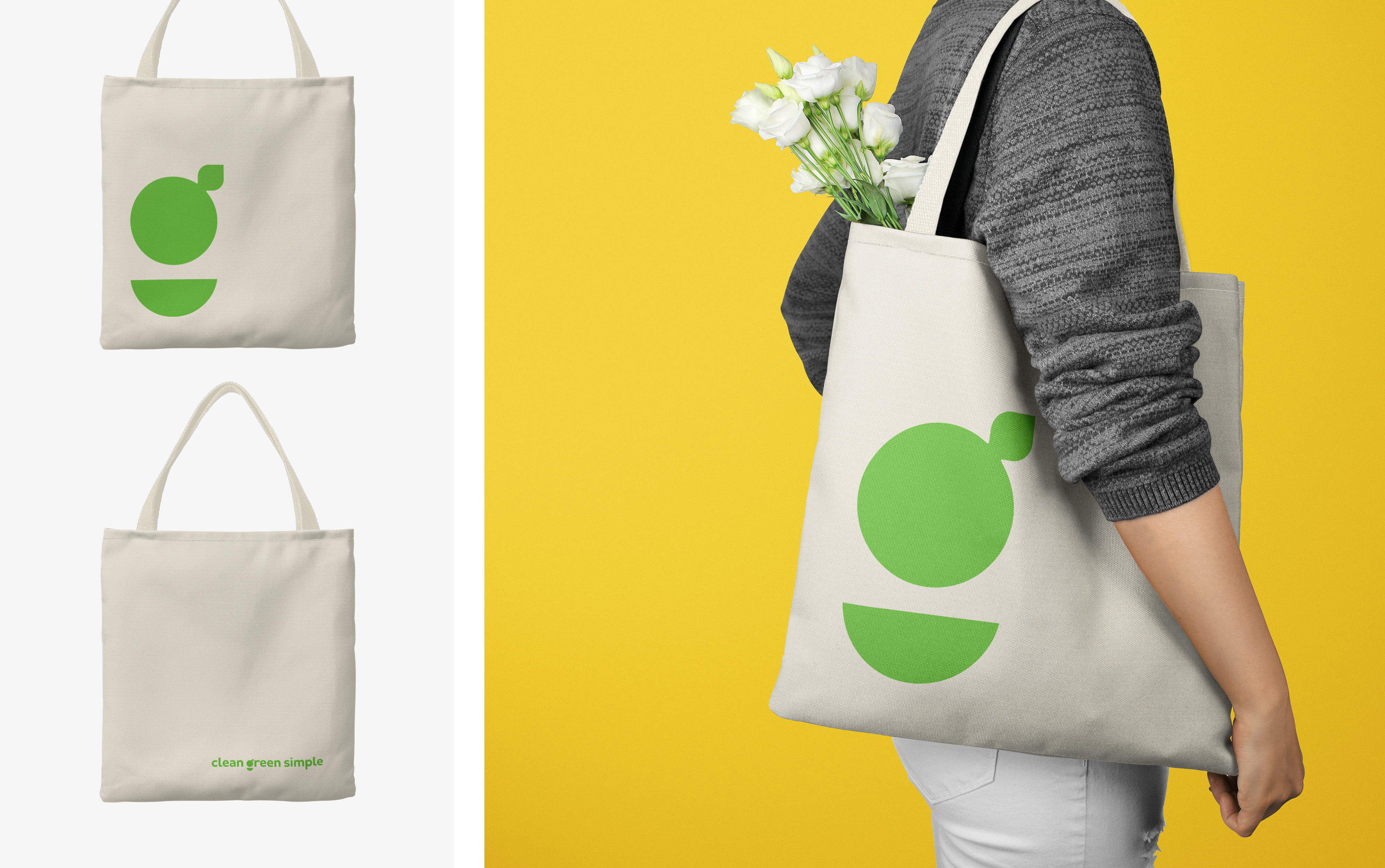
THE SOLUTIONMuch like their name boasts, the new brand identity is clean, green, and simple. But it's much more than that. Working closely with the client through the discovery phase, we developed a strategic plan and new brand identity based on the brand assessment and online publishing requirements. Clean Green Simple's new primary logo complies with all of Google’s standards, and by specifically developing a wordmark as the logo, online optimization is further maximized. The refined design allows for optimum clarity at small sizes—a key online publishing detail, particularly for the brandmark and Google’s increase in displaying search results exclusively with a favicon. Beyond all the technical details, the new iconic G brandmark is a symbol for the clean eating, healthy lifestyle, and sustainable living that Clean Green Simple’s readership desires. Made up of two elements, the top portion of the mark represents plant-based foods, such as fruits and vegetables, falling into the bowl below, symbolic of how healthy eating is making its way into family lifestyles, more and more. The mark is also a nod to sustainability and the need for all of us to be kind to our planet. The simple and friendly design of the wordmark was customized entirely around the aesthetics of the brandmark, unifying the two beautifully. Inspired by Mother Nature herself, a new bold and bright color palette was developed. From leafy greens and vibrant vegetables to garden soil, the brand colors were carefully selected for their industry influences—food and health; gardening and agriculture; and of course, the environment.
THE SOUVENIRSAmerican Advertising Awards, Gold ADDY for Logo DesignAmerican Advertising Awards, Gold ADDY for Brand Identity CampaignCommunication Arts Award of Excellence for Logo DesignMUSE Creative Award for Logo Design