Mews on Maxwell
SERVICES Logo Design & Brand Identity Development / Tagline Development / Collateral Design / Signage Design
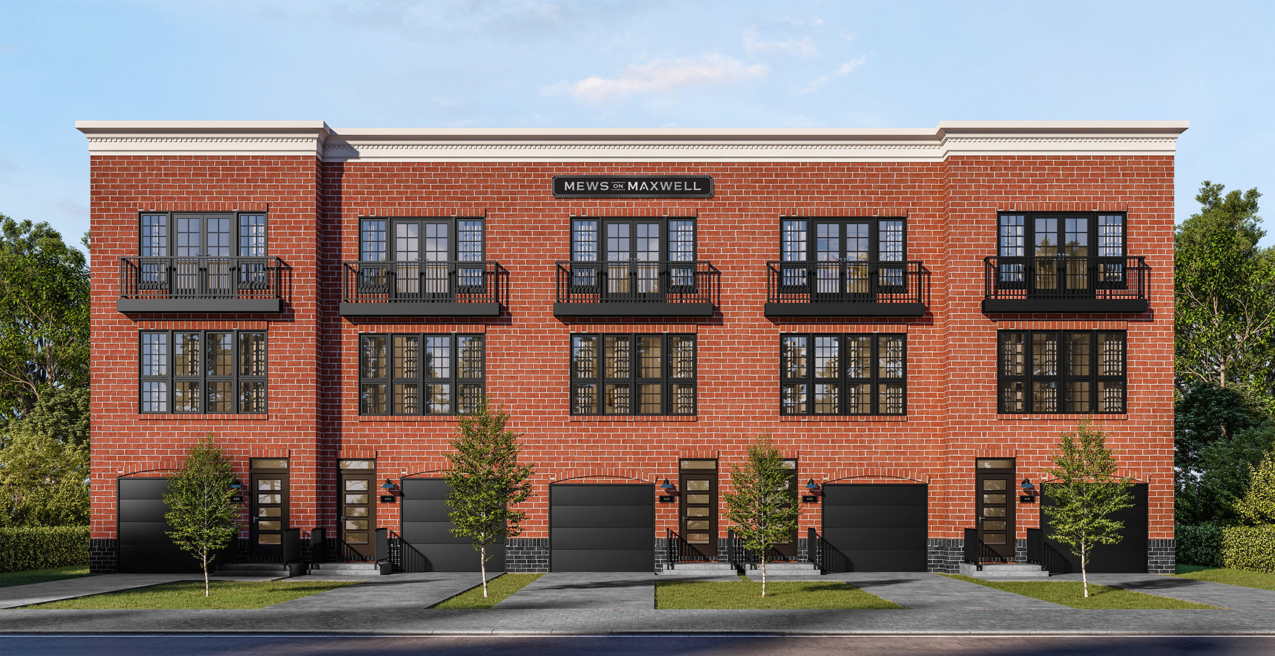
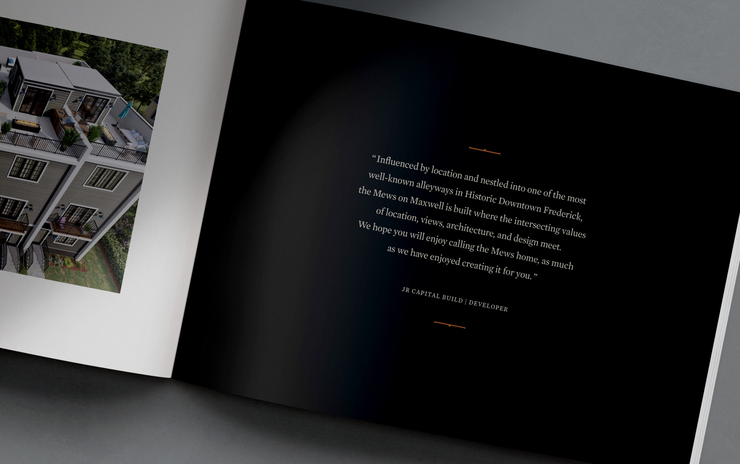
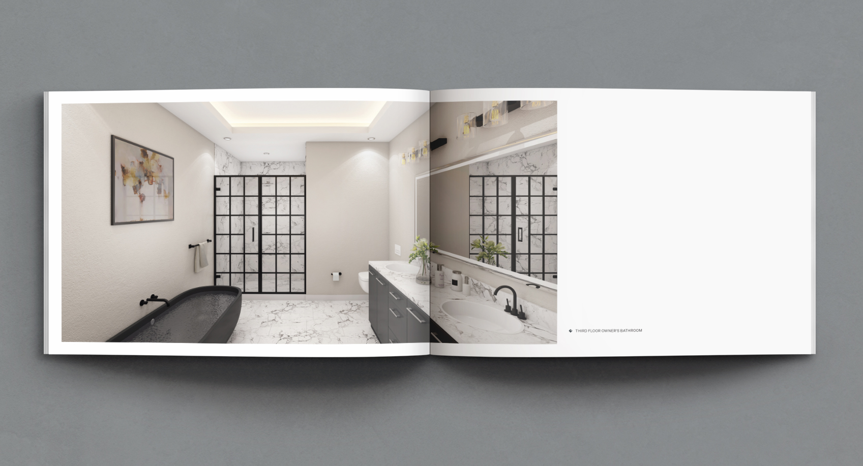
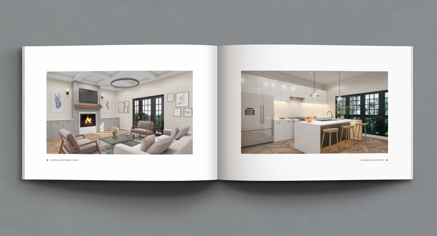
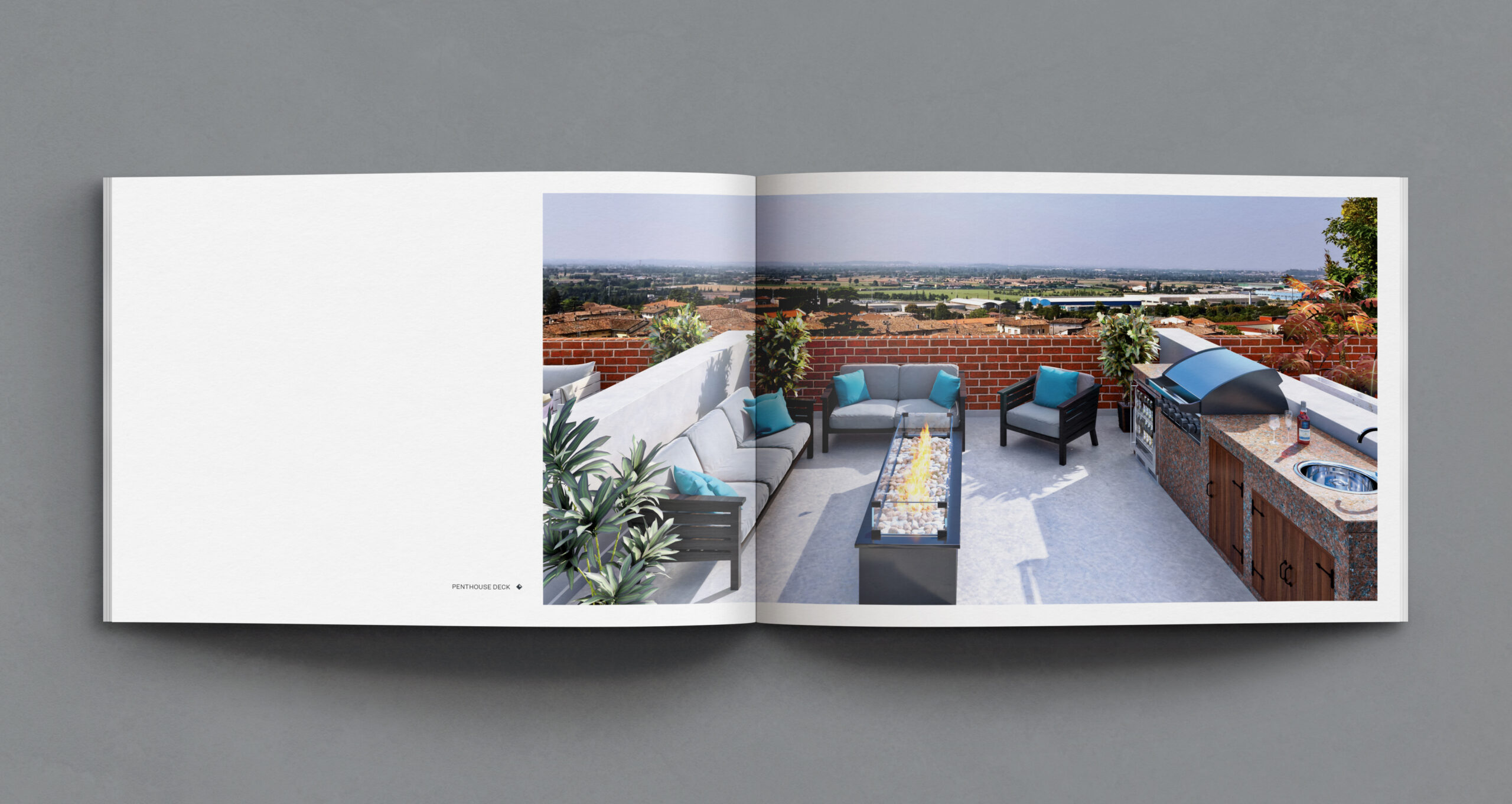
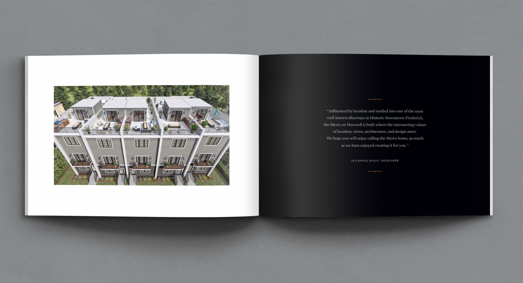
THE STORYReal estate developer JR Capital Build had a vision for a new boutique luxury property in historic downtown Frederick, Maryland. The development features five stunning townhouse units, each spanning four floors, including a penthouse deck with panoramic views. The design concept was based on traditional English mews-style architecture with a modern, luxe vibe. Typically found in some of London’s most exclusive neighborhoods, a traditional mews house evolved from 18th century carriage houses. JR Capital Build’s Mews on Maxwell needed to reflect this traditional notion while complementing the surrounding ambiance of the historic neighborhood. Because the City of Frederick's Historic Preservation Commission has stringent guidelines for all architectural builds and revitalization projects, there were many details to considered. The JR Capital Build team came to Lisa Sirbaugh Creative to help them develop a brand identity that reflected the design build concept and neighborhood character as much as it respected the historic district’s regulations.
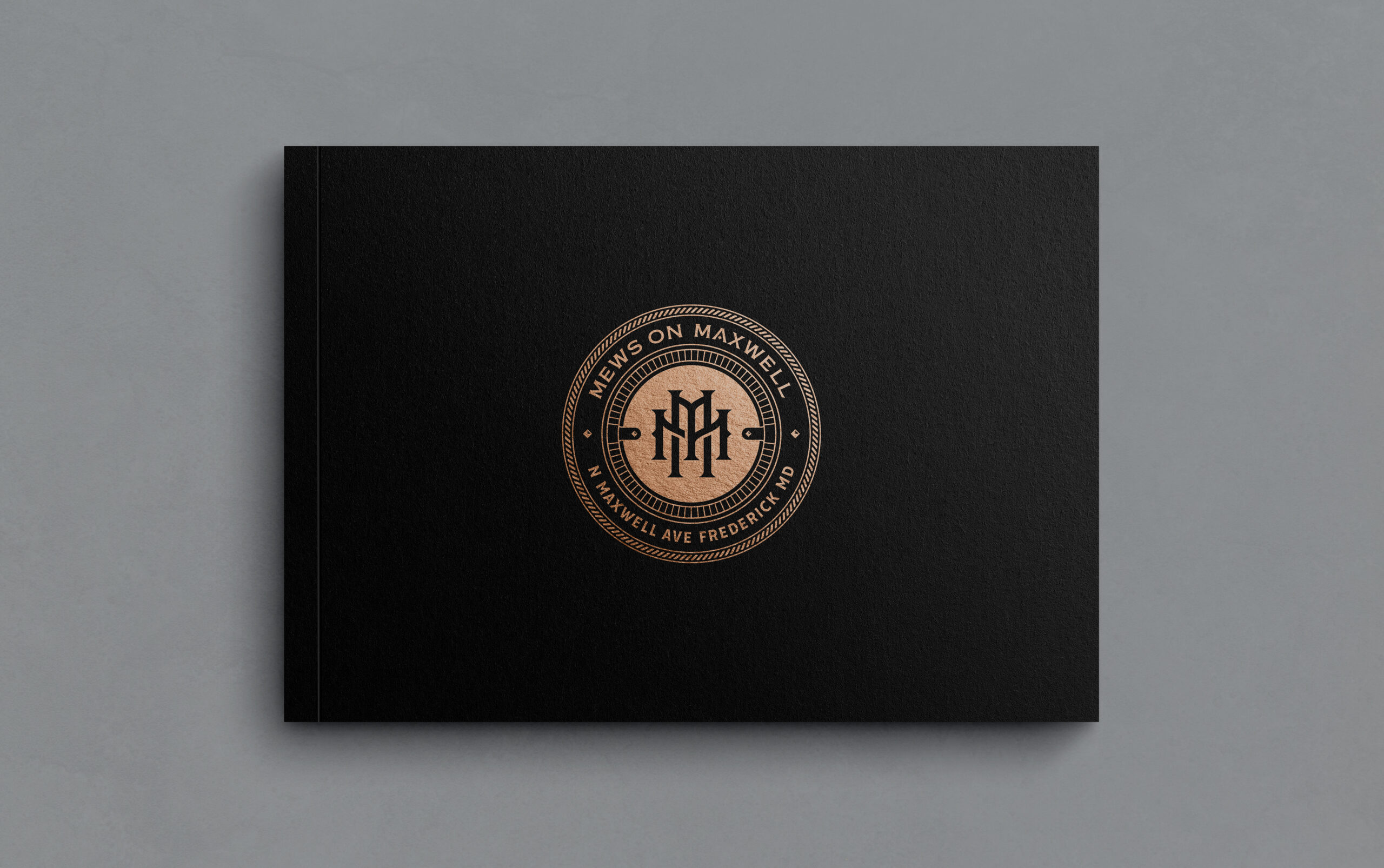
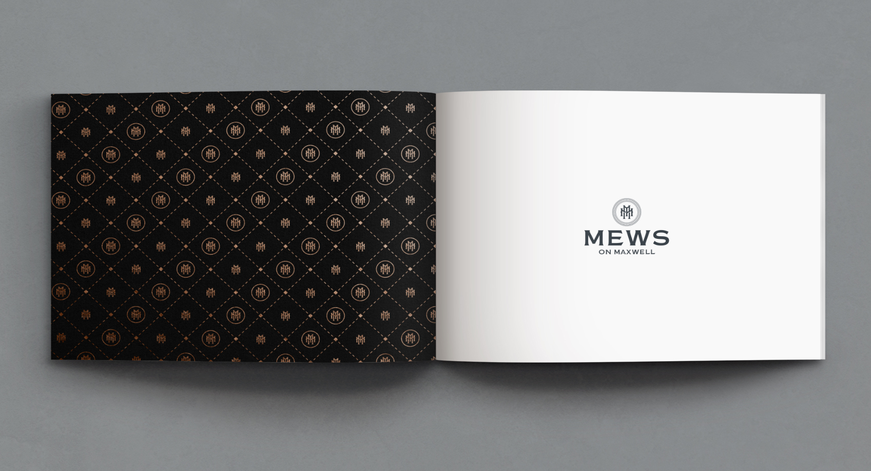
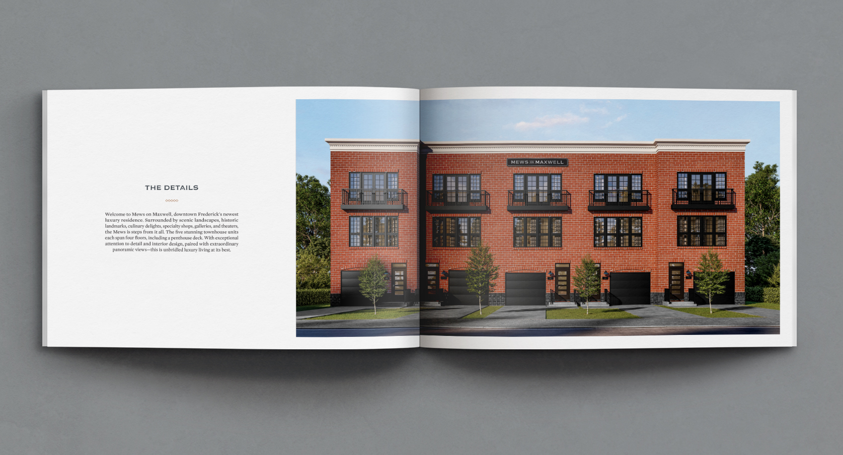
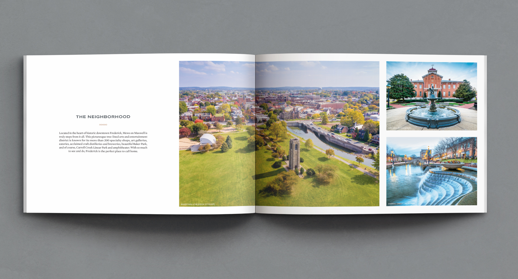
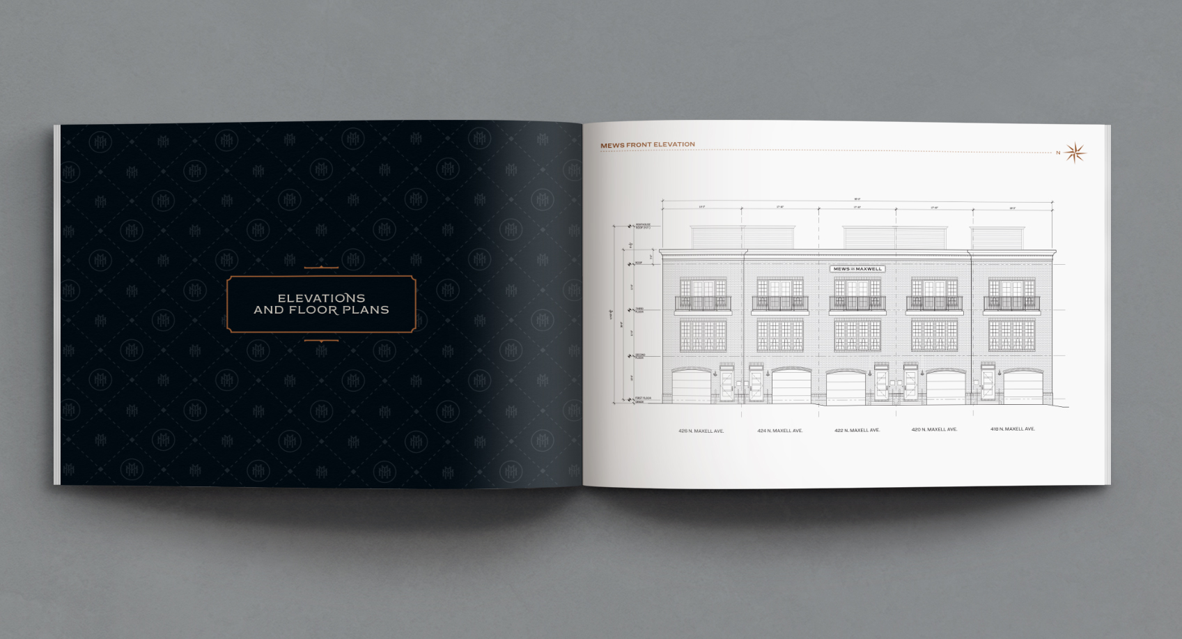
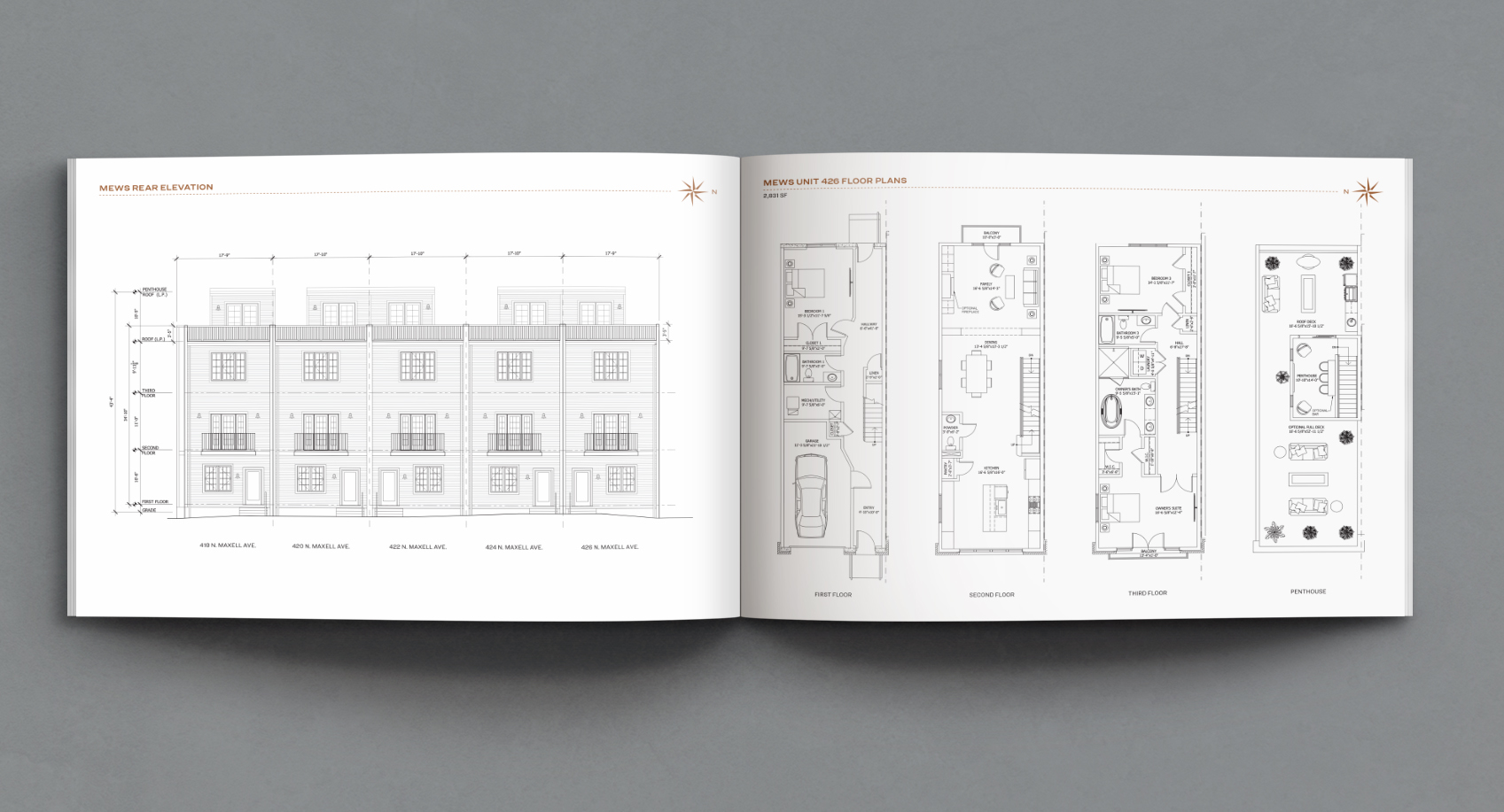
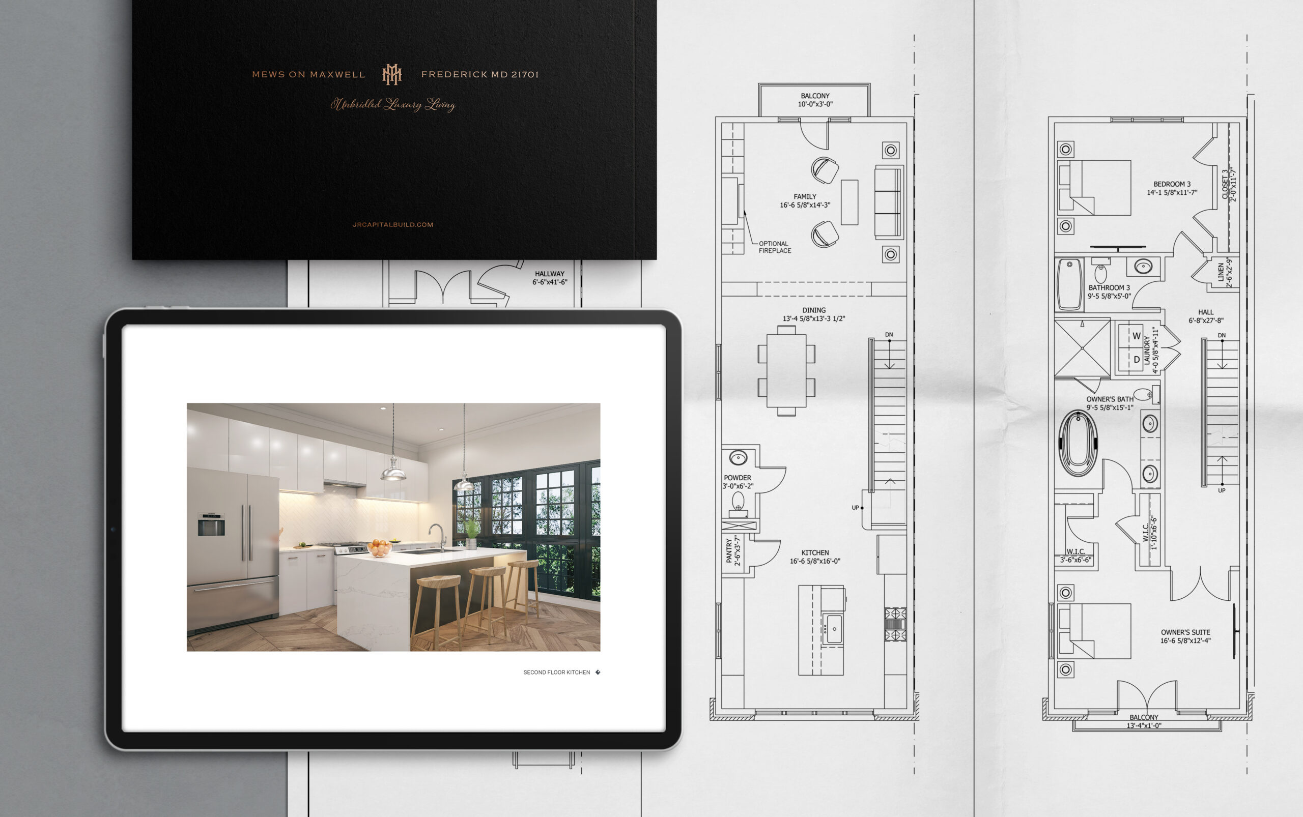
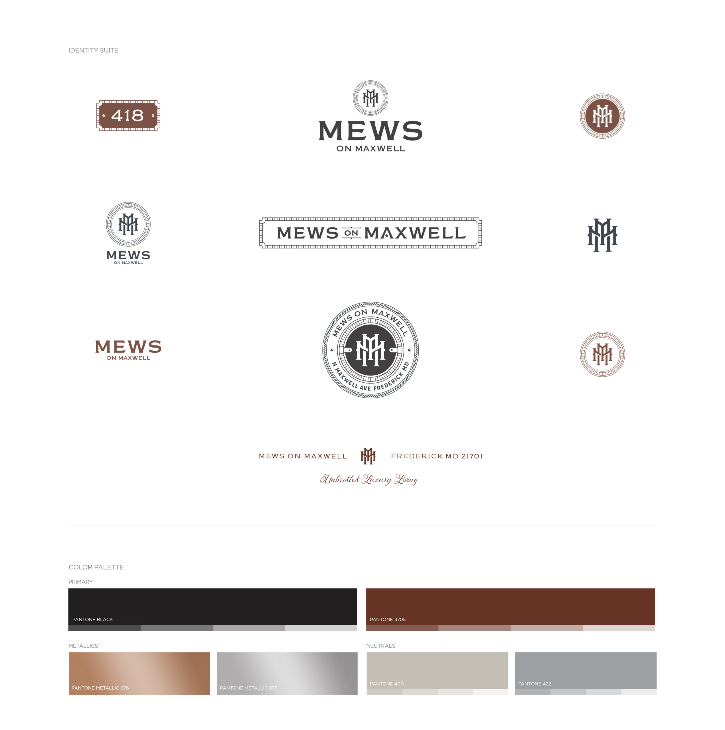
THE SOLUTIONWhile we always start with brand discovery, our process is flexible and tailored to client needs and project objectives. In this case, our branding and graphic design services kicked off with a brand attributes exercise. This allowed us to establish how the property will be perceived through the visual identity and all associated print and digital materials. Our research included an extensive walking tour of Frederick’s charming downtown district. We discovered and photographed historic signage, architectural details, building facades, color, and typography. Our exploration didn't stop there, we also researched traditional mews, their origins, and architecture. This imagery and insight helped us create a relevant mood board that became the inspiration for the new brand. Project deliverables included a brand identity suite, tagline, property signage, and a sales and marketing viewbook. When it came to the logo design and developing the full identity suite, we were inspired by Frederick's architectural details, historic mews characteristics, and the client’s design build concepts. The interlocking M brandmark is symbolic of mews’ interior stall architecture and is a nod to the Mews on Maxwell name. Typography played a fundamental role in the brand identity—the logotype features a typeface carefully selected for historic accuracy and customized for the brand. When it came to developing the color palette, we took a cue from the Mews’ exterior architecture, which complements hues found throughout the historic district. To cap things off, the tagline developed for the brand speaks to the modern-luxe design build while playfully nodding to the property’s name. Whether you’re a prospective tenant, visitor, or neighborhood resident, the resulting brand identity and marketing materials convey that Mews on Maxwell is also a kind of muse to the distinctive vibe of the district itself.
THE SOUVENIRSAmerican Advertising Awards–Regionals, Silver ADDY for Logo DesignAmerican Advertising Awards–Regionals, Silver ADDY for Brand Identity CampaignAmerican Advertising Awards, Judge's Choice Award for Logo DesignAmerican Advertising Awards, Gold ADDY for Logo DesignAmerican Advertising Awards, Gold ADDY for Brand Identity CampaignCommunicator Awards, Award of Excellence for Brand & Identity CampaignCommunicator Awards, Award of Excellence for Promotional CollateralFCBIA Award of Excellence for Best Townhouse ProjectGraphis Design Award for BrandingGraphis Design Award for Brochure DesignLogo Lounge Book 14