Pursuing Pinot
SERVICES Logo Design & Brand Identity Development / Tagline Development / Collateral Design / Social Media Asset Design
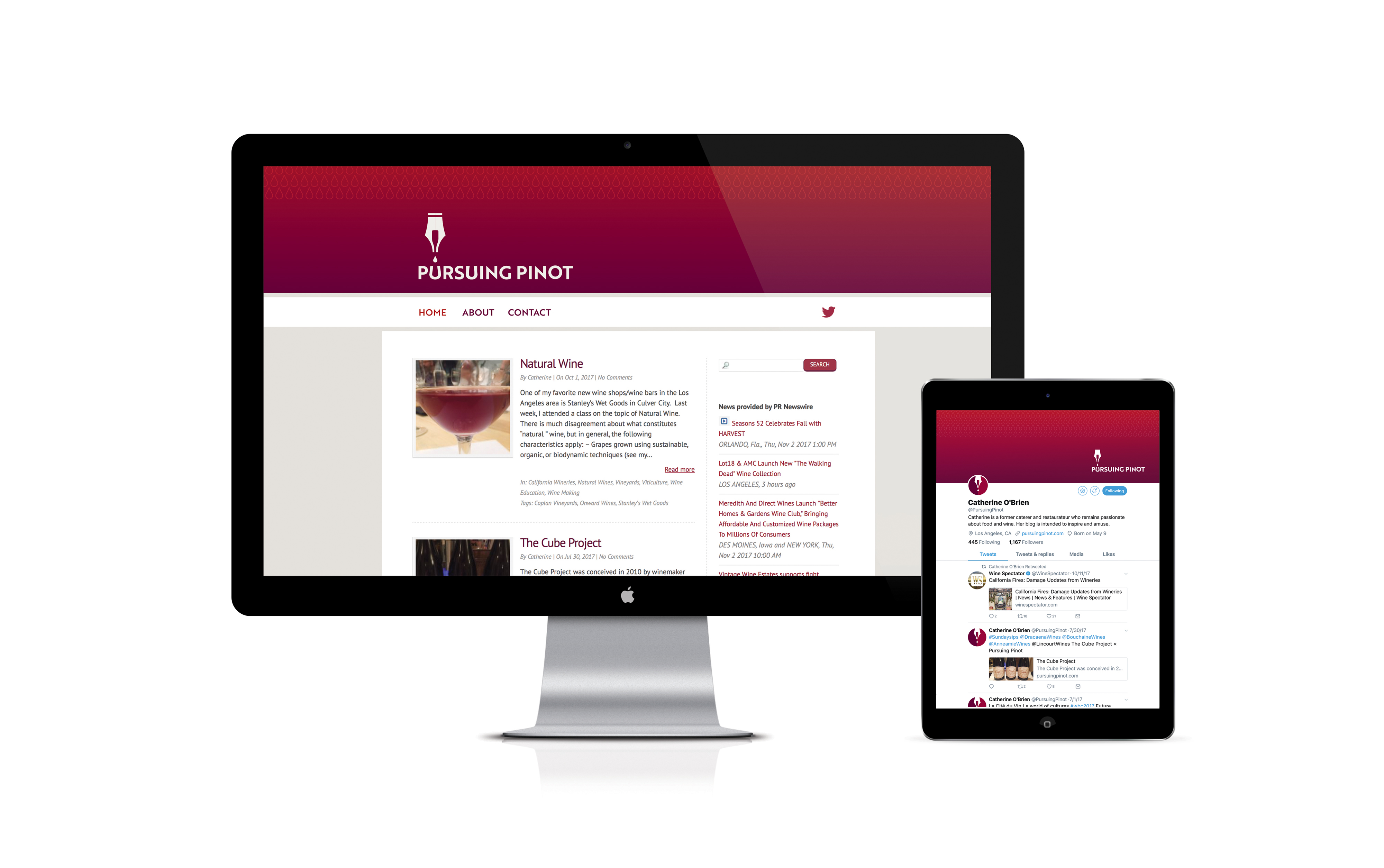
THE STORYPursuing Pinot is the blog and social media presence of California-based writer and wine enthusiast/influencer, Catherine O’Brien. Make no mistake, this isn’t just some random little hobby. Truth be told it started out that way, but it’s become a respected and well-read resource for casual sippers to adventurous oenophiles. As such, Catherine wanted to elevate Pursuing Pinot’s brand and identity to a place equal to what readers had come to expect from its rich content. That's when Catherine reached out to Lisa Sirbaugh Creative. We discussed rebranding objectives and determined brand characteristics. It was clear that the new brand presence needed to convey the perfect blend of sophistication (without being lofty), refinement, and vibrancy.
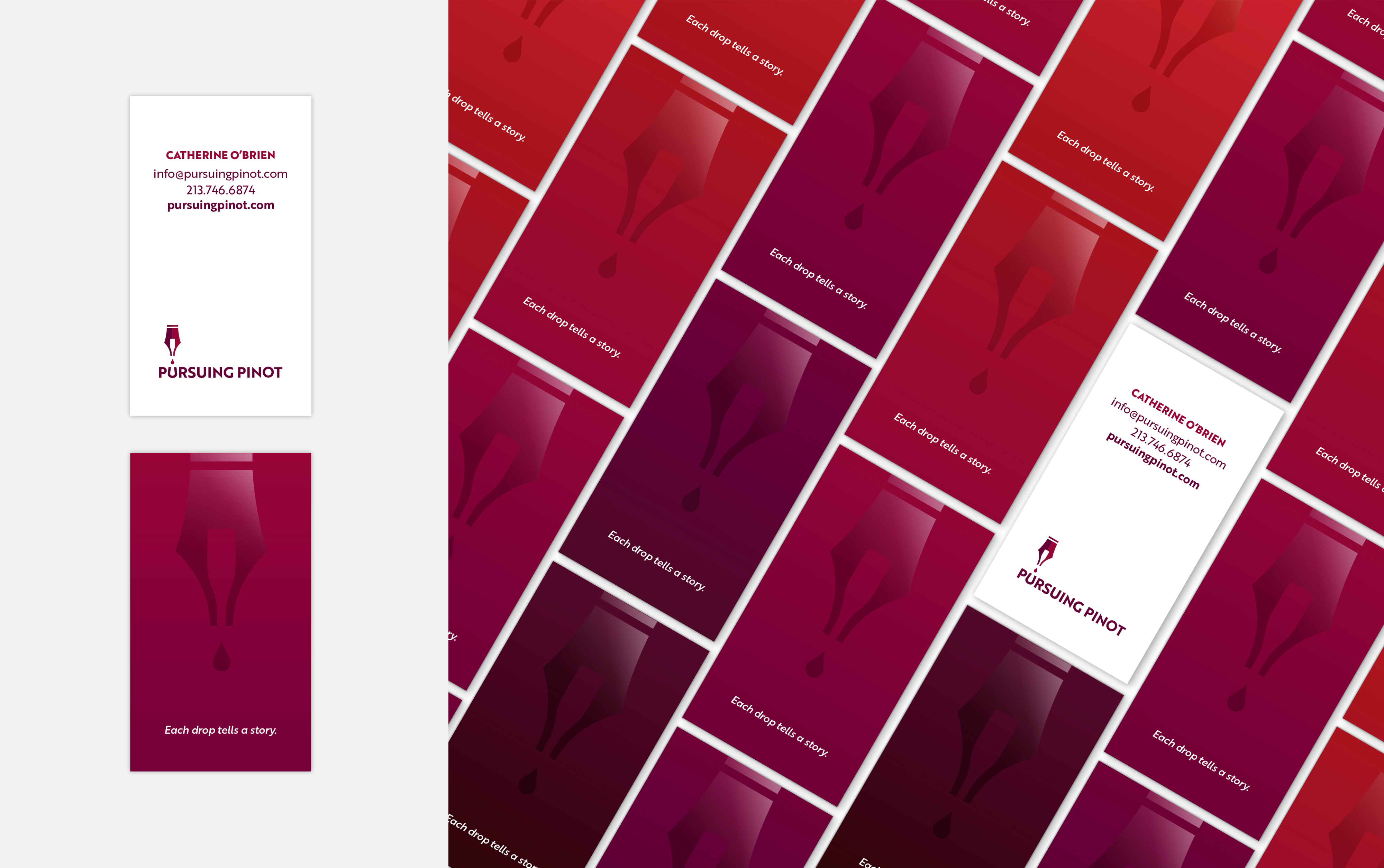
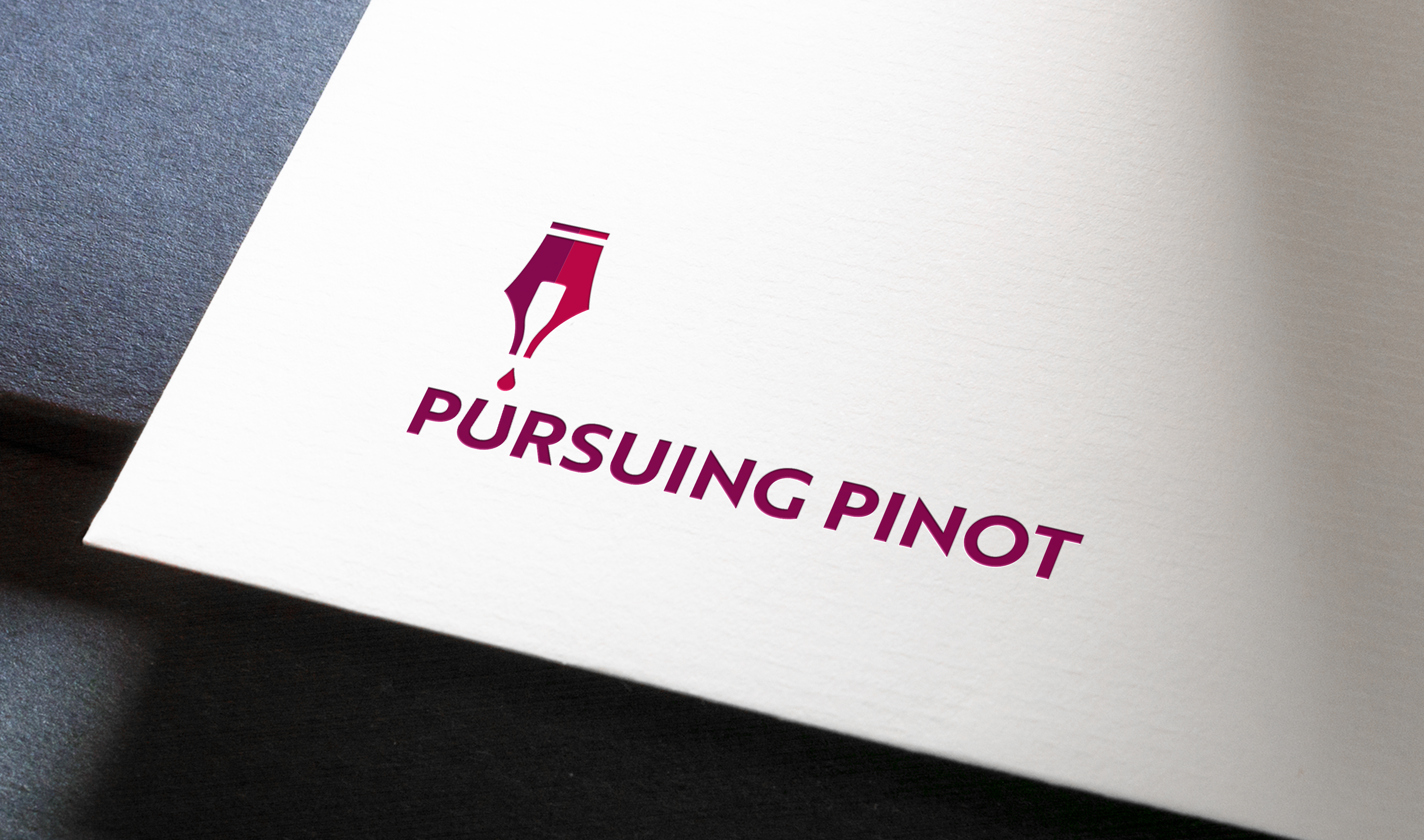
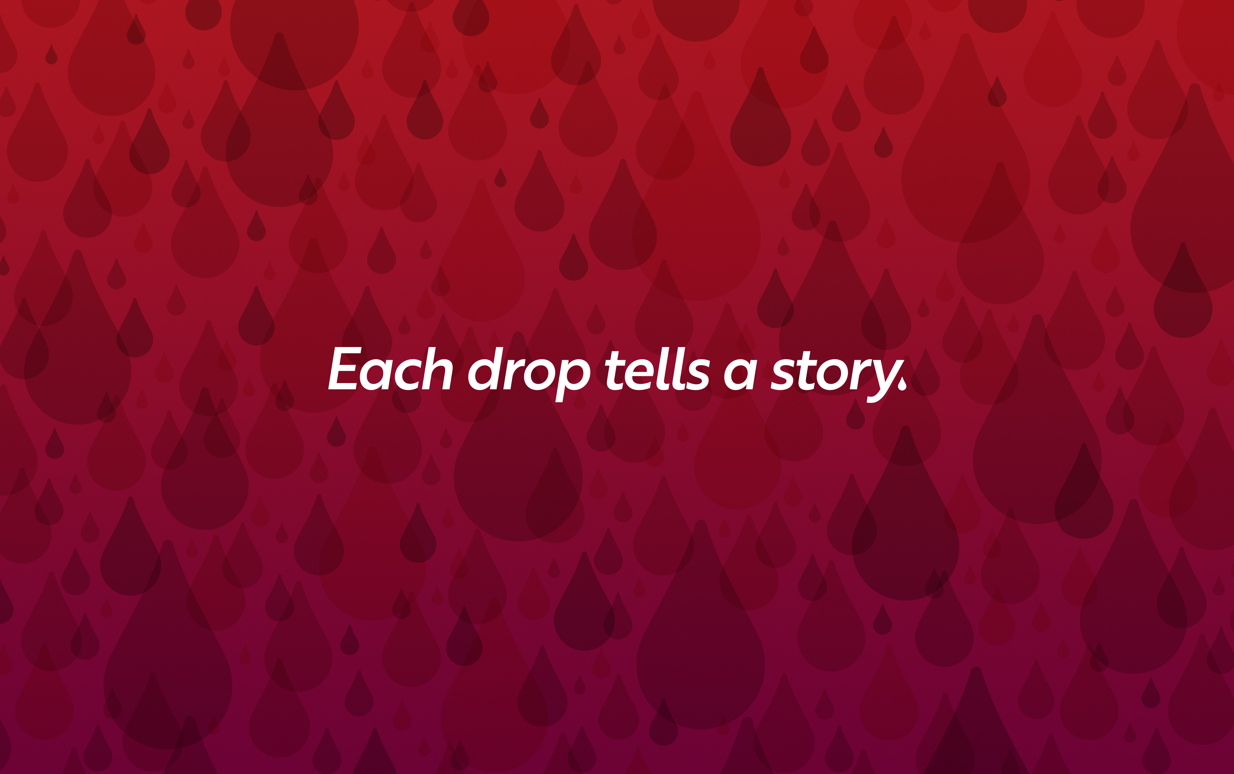
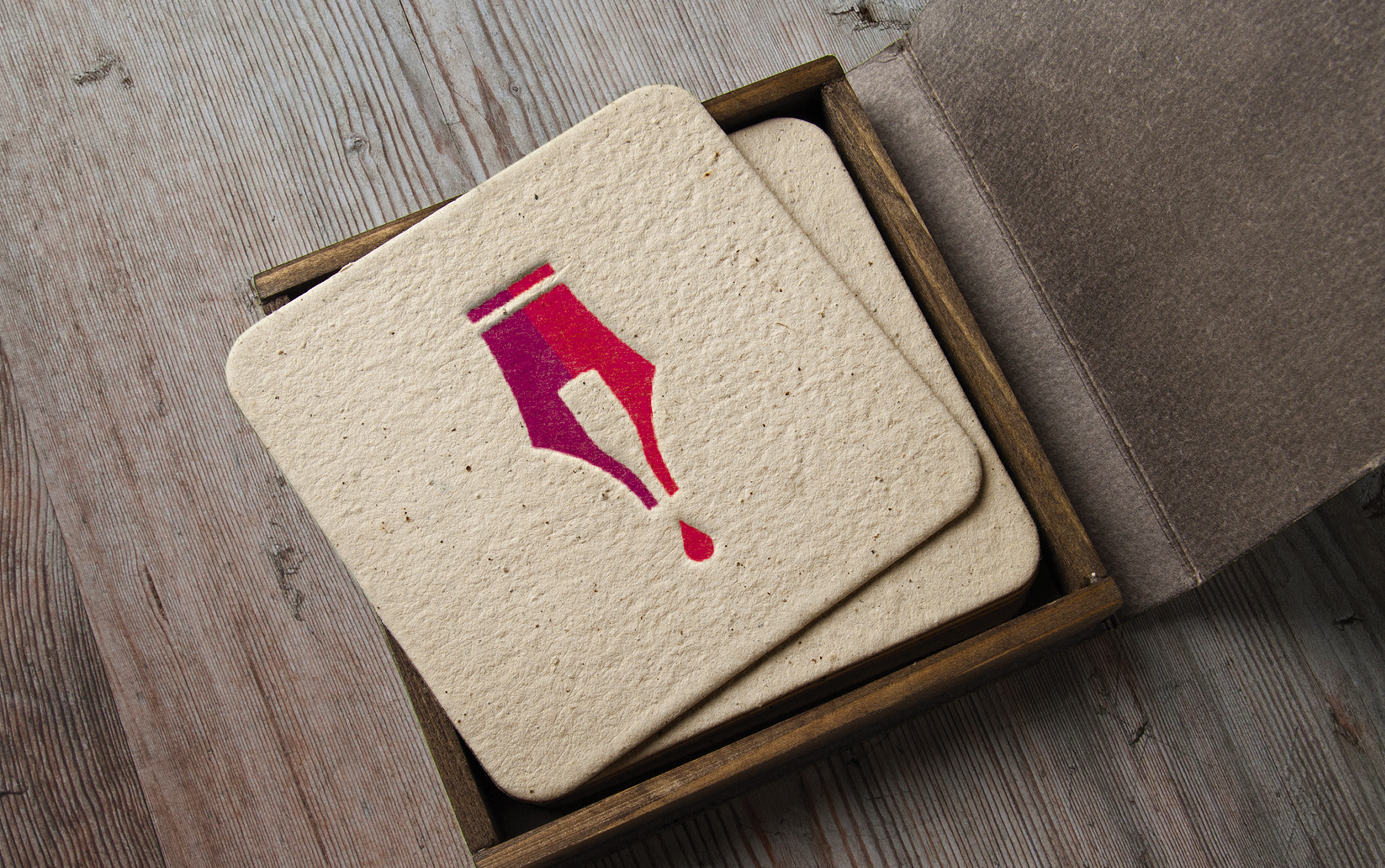
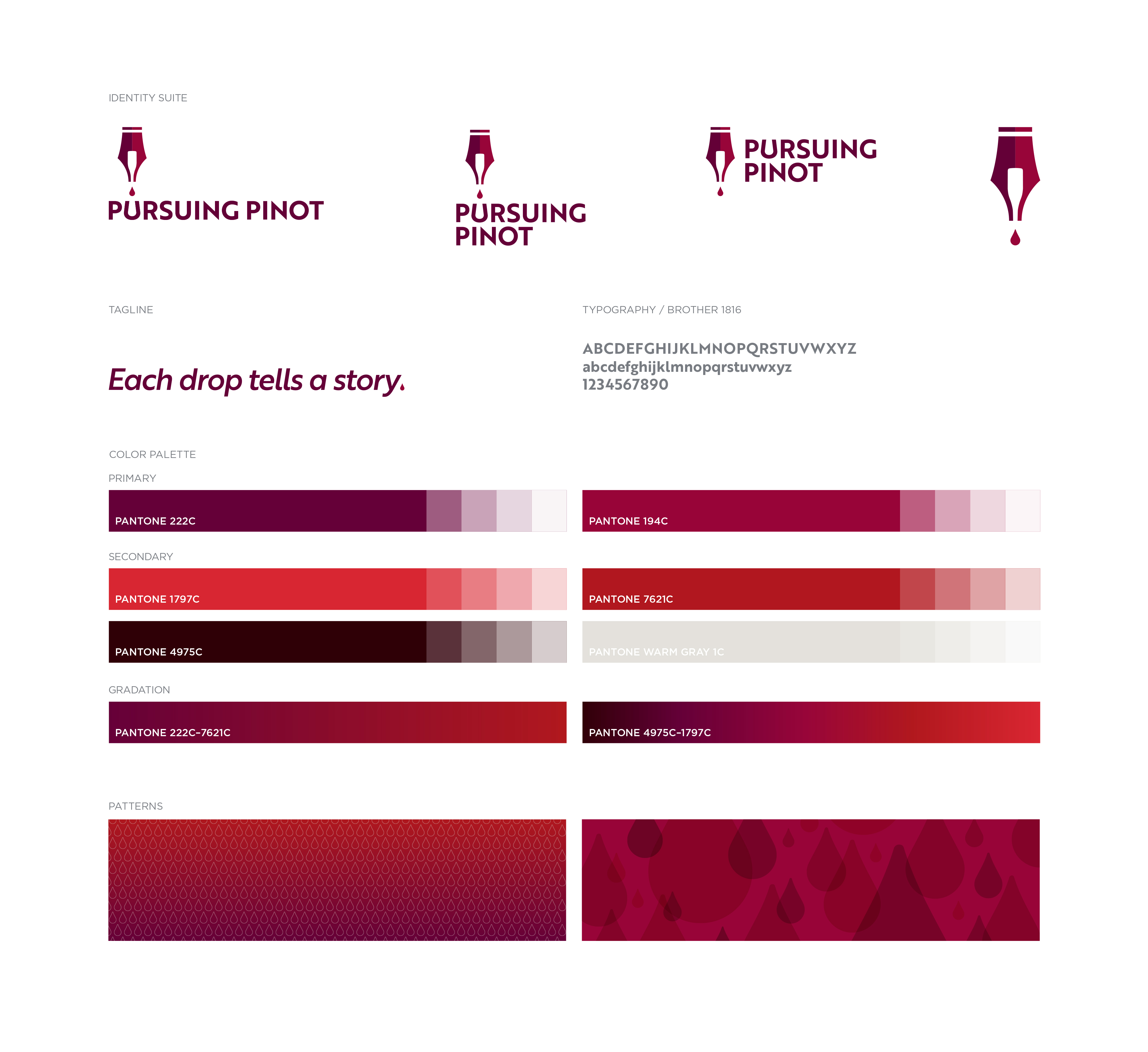
THE SOLUTIONWhile Pursuing Pinot exists solely online, Catherine keeps it old school when it comes to her approach to writing. You’ll often find her walking a vineyard or at a hip L.A. wine bar with pen and pad in one hand and a glass in the other. That says a lot about her–she loves the craft of writing as much as the subject matter. That's why a fountain pen seemed perfect for the centerpiece of the new brand identity suite. From there the inspiration for the brandmark’s other graphic elements flowed like ink from an inkwell. In the negative space, forming the two nibs of the pen tip, you'll see an inverted pinot noir bottle. Out of the hidden bottle, a drop of wine—or is it ink? A lovely visual double entendre. Not to leave a single detail unturned, the clean, modern logotype features a customized U that doubles as a stemless wine glass. From there our copywriter developed the perfect tagline pairing for this brand—Each drop tells a story. When it came time to develop the color palette we did some “pursuing of pinot” by researching the red wine color scale. This exploration was the foundation for the new comprehensive "pinot noir spectrum" color palette. The secondary gradient spectrum can be found beautifully showcased across Pursuing Pinot's business card series. Each card features a different red variance, from light to full bodied. The perfect rich backdrop for highlighting the brandmark in a sophisticated liquid-shine clear spot gloss. I adore being a designer. I have a similar adoration for wine. When Confucius said “Choose a job you love and you’ll never work a day in your life.” I’m pretty sure he was talking about this particular project.
THE SOUVENIRSAmerican Advertising Awards–Regionals, Silver ADDY for Logo DesignAmerican Advertising Awards–Regionals, Silver ADDY for Brand Identity CampaignAmerican Advertising Awards, Judge's Choice for Brand Identity CampaignAmerican Advertising Awards, Gold ADDY for Logo DesignAmerican Advertising Awards, Silver ADDY for Brand Identity CampaignMUSE Creative Award for Logo DesignLogoLounge Book 11

