Queue Aligners
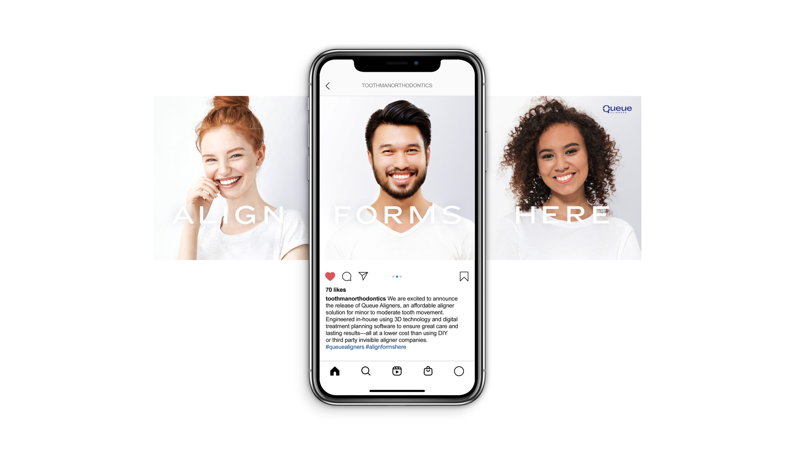
SERVICES Brand Discovery & Strategy / Brand Naming / Logo Design & Brand Identity Development / Tagline Development / Packaging Design / Social Media Marketing Design
THE STORYQueue® Aligners is a state-of-the-art digitally engineered system designed to bring people’s best smiles forward. The orthodontic specialists behind this game-changing dental alignment program don’t believe in a ‘one size fits all’ approach. With the understanding that successful, lasting results only come from a tailored strategy, they developed a whole new treatment system. One that’s completely customized to each patient’s unique dental situation and needs, and closely monitored over the course of the program. Their mission is to give each person the attention and care they deserve, and a beautiful, healthy smile that will last a lifetime. The developers of this new aligner system came to Lisa Sirbaugh Creative to create a highly appealing, polished brand, visual identity, and packaging suite that not only aligned with their mission and goals, but also with their exclusive new product.
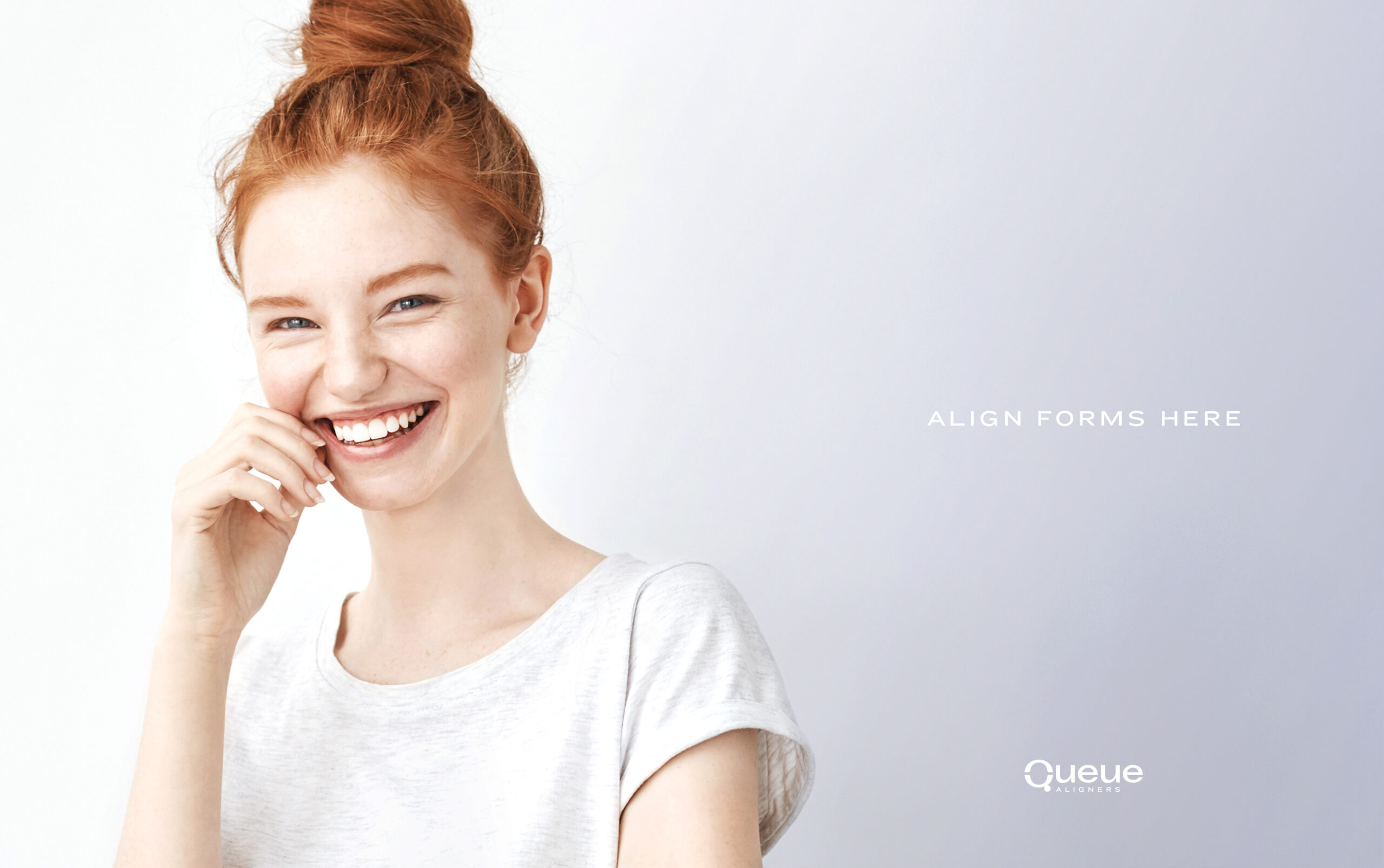
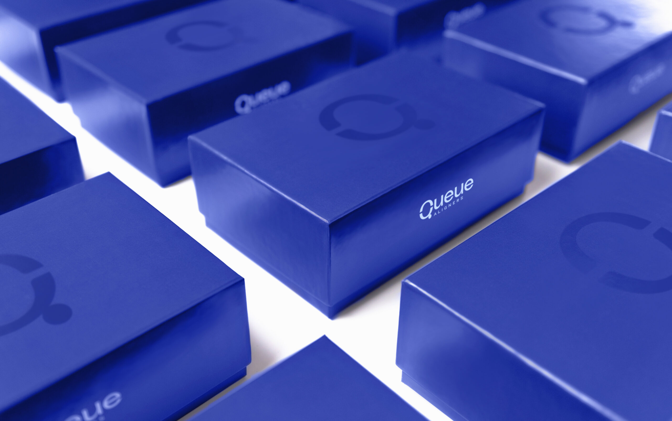
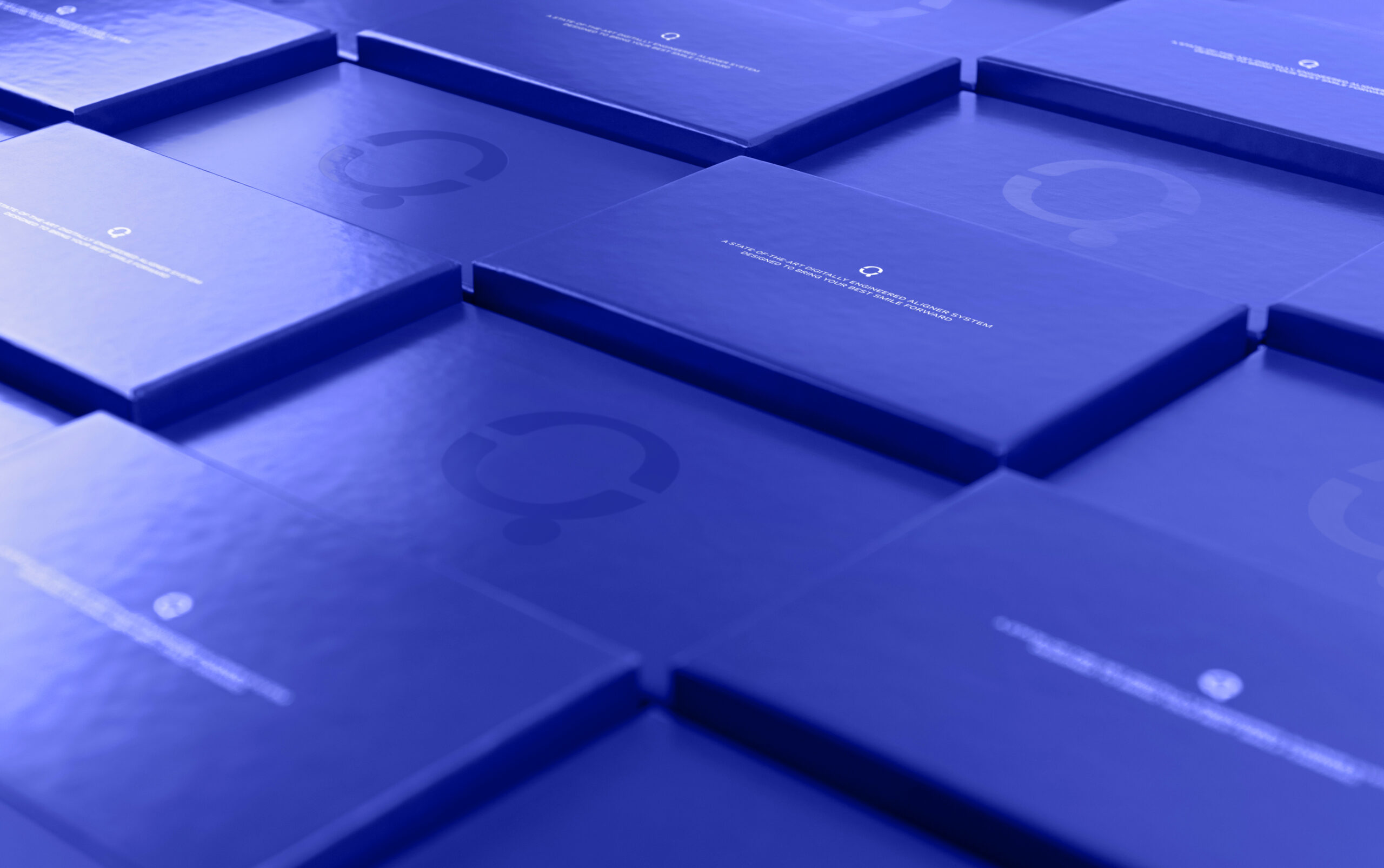
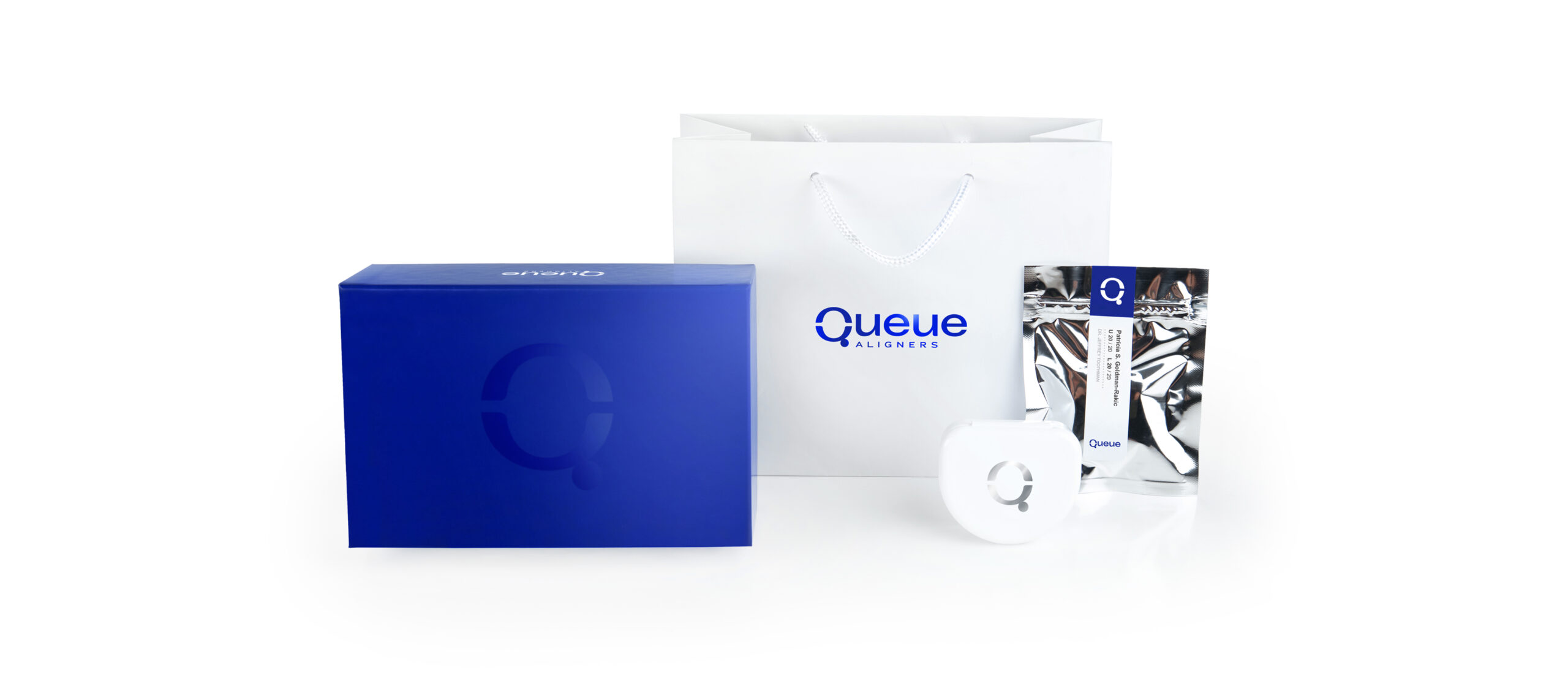
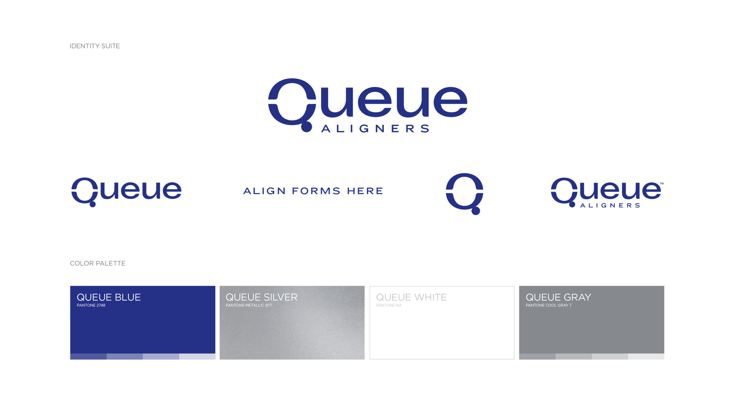
THE SOLUTIONOur objective was to differentiate Queue Aligners from similar products in the marketplace by giving the brand a strong platform that would speak to the consumer. While it’s true that the engineering and technology behind this aligner system are intricate and impressive, what people really care about is having a beautiful, confident smile. With the health and aesthetic goals of the customer in mind, our target was to create a brand that's both approachable and desirable. Additionally, we wanted to highlight this unique product’s benefits—it’s sleek, refined, and it works, straight out of the box. Our first order of business was developing the brand name and tagline. After quite a bit of research and concepting, we landed on something so simple and perfect that in hindsight the choice seemed obvious, Queue Aligners–Align Forms Here. (Kudos to our copywriter!) Next, we established a sleek logo design, full identity suite, and color palette that reflects trust but also demonstrates the high-tech, polished solution behind their product. From there we developed, messaging, packaging, collateral, advertising, and more. The end result—a brand that is bold, confident, and clean, just like the product's results. When all the pieces line up, the Queue Aligners brand assures confidence in the consumer and that the solution to their unique, beautiful smile is right there in their hands.
THE SOUVENIRSAmerican Advertising Awards, Silver ADDY for Brand Identity CampaignDieline Feature for Packaging DesignMUSE Creative Award for Brand Identity DesignMUSE Design Award for Packaging DesignPackaging of the World Feature for Packaging DesignWorld Brand Design Society Feature for Branding & Packaging Design

